Problem Statement
Sony wants a mobile-first responsive landing page to promote sales of their new product, PS4 Pro, targetting 16-44 year olds. It should be integrated with Amazon.co.uk and leverage Game Day event sale in the UK.
Challenges
- A landing page that drives sales
- The landing page provides a seamless experience on both mobile and desktop devices.
- Despite detailed information, it should not cause cognitive overload
- Should be engaging to 16-44 yrs old
- The landing page should be designed with Game Day in mind, where gaming products have offers to attract customers.
Action
- Design thinking process was employed.
- The process was used to identify user needs, define goals, generate ideas, create prototypes, and conduct testing.
- Through empathy and research, user preferences were understood.
- The defined goals guided ideation and prototyping, leading to the creation of two UI designs. Testing generated results, driving iterative improvements.
Result
- The developed landing page was a great improvement from the similar brand store landing page of PS3 on Amazon.com
- Click-through rates increased by 59%
- The average time spent on the page increased by 87%
- Sale conversion rates increased by 43%.
Key Learnings
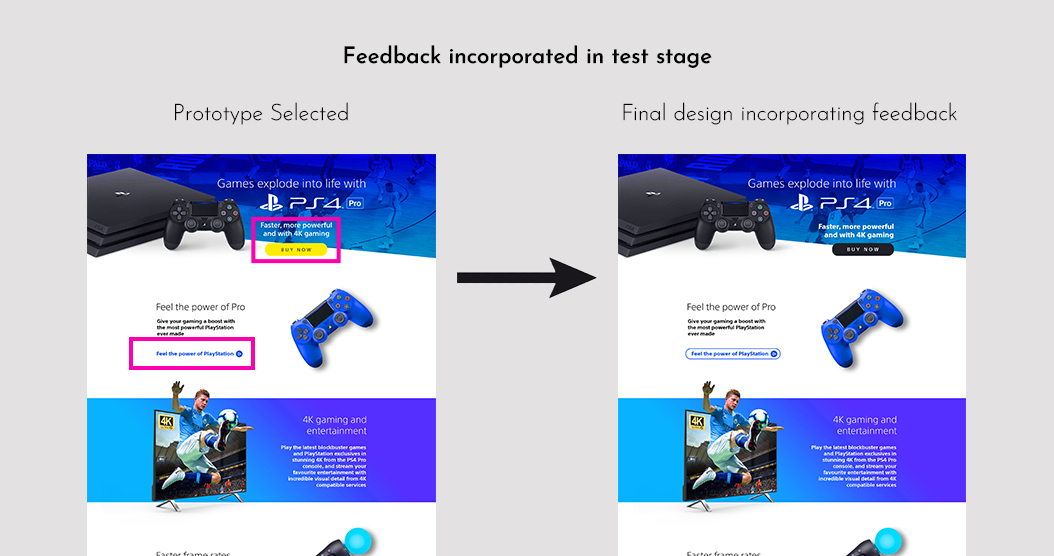
- Yellow does not work as the best colour for a CTA in all situations
- Young gamers like bold colours and graphics but it should be balanced with minimalism to avoid cognitive overload
- Video button works better as a regular button when there is already a CTA to drive sales
- Mobile-first approach should be key in designing because ~93% users use smartphones to visit a landing page
Researched the brand:
Analyzed the existing brand website of PlayStation (https://www.playstation.com/en-us/explore/ps4/) and the product page on Amazon (https://www.amazon.co.uk/dp/B07K14XKZH) to gather insights into visual style, messaging, and key features.
Researched Game Day:
Identify the thematic mood of the target audience during the Game Day event. Analyse from the user perspective if the game day will actually help increase sales. In the UK, this big nationally celebrated day is all about games, and leveraging the national mood would aid the campaign in getting better results
Researched Competition:
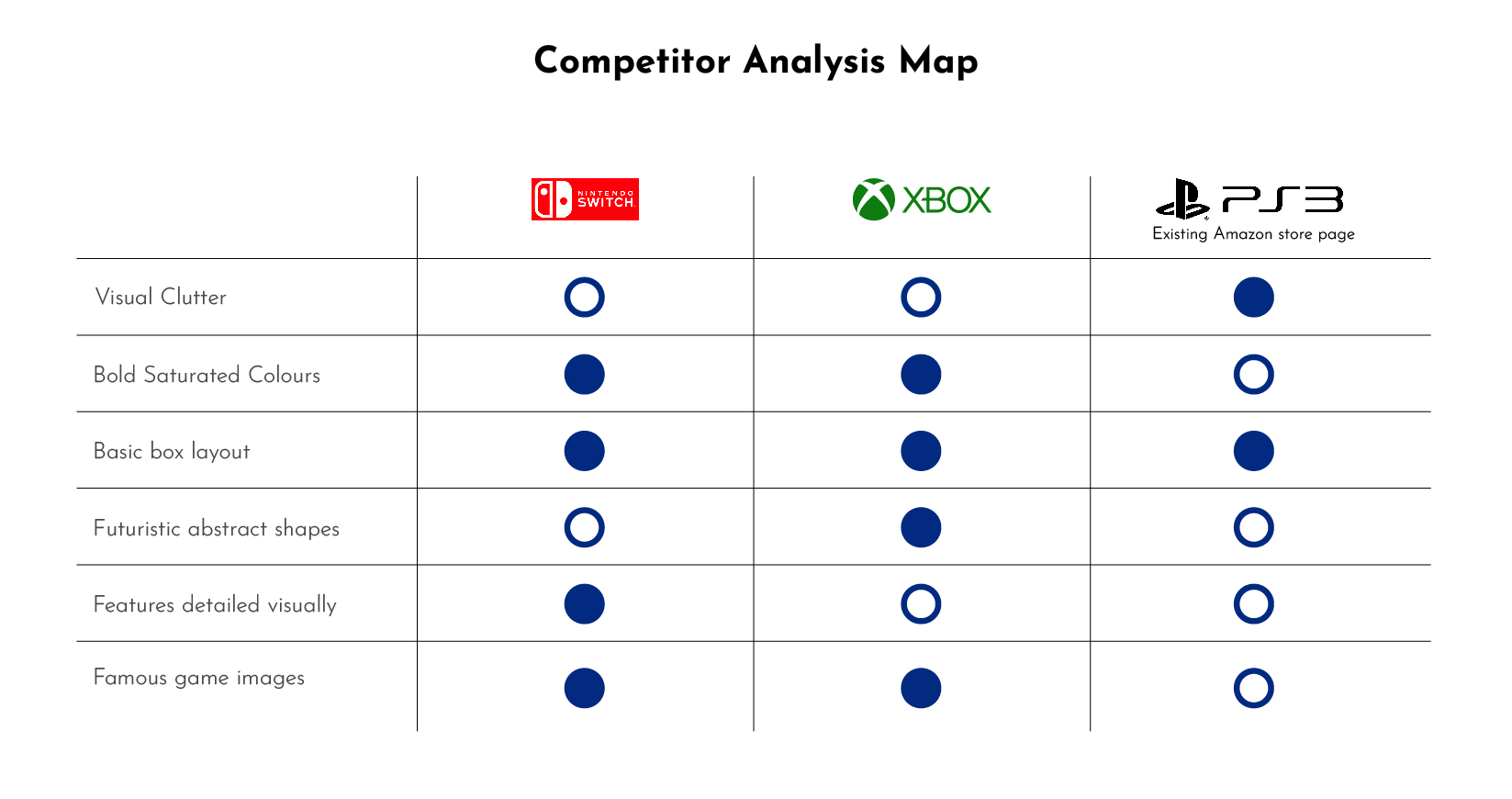
A visual analysis of the websites of competitors like XBOX and Nintendo offering gaming products and landing pages in the UK market was performed.
User Research & Target Audience:
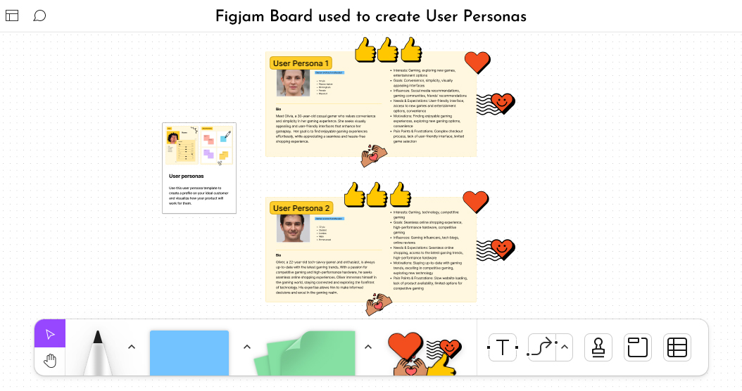
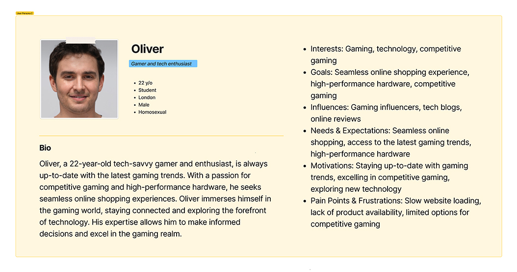
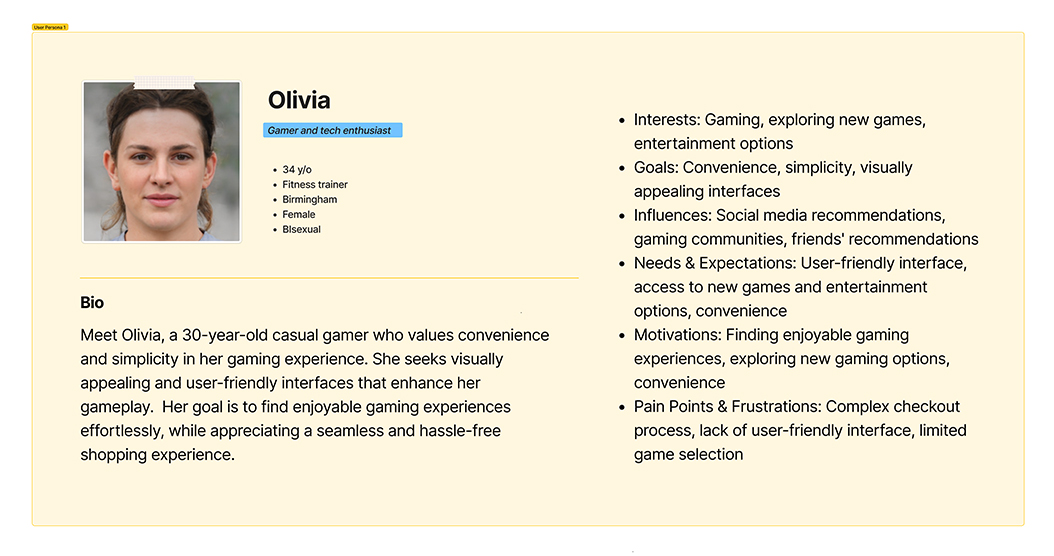
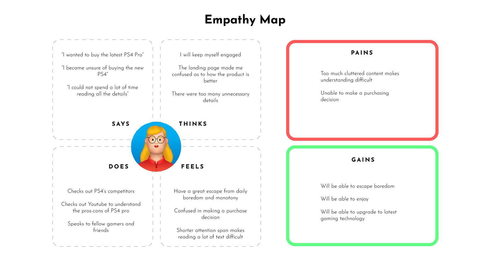
User research was conducted to understand the target audience’s preferences, behaviour, and expectations related to gaming products. Existing market research reports and articles on the internet, and customer feedback from previous PlayStation landing pages and product pages on Amazon.com were analyzed to gain a broader understanding of the target audience (16-44 years old). User Personas and Empathy map based on it were created too.
- Male: 65%, Female: 35%
- Characteristics of target audience: Young UK residents, tech-savvy, passionate gamers, use mobile phones more than desktops, prefer detailed product information during shopping experiences, prefer the latest best-performing gadgets, prefer visually appealing clean UI, check customer reviews while buying, love offers and discounts, love big screens and high-resolution graphics
User Personas Created Using Figjam
Goals:
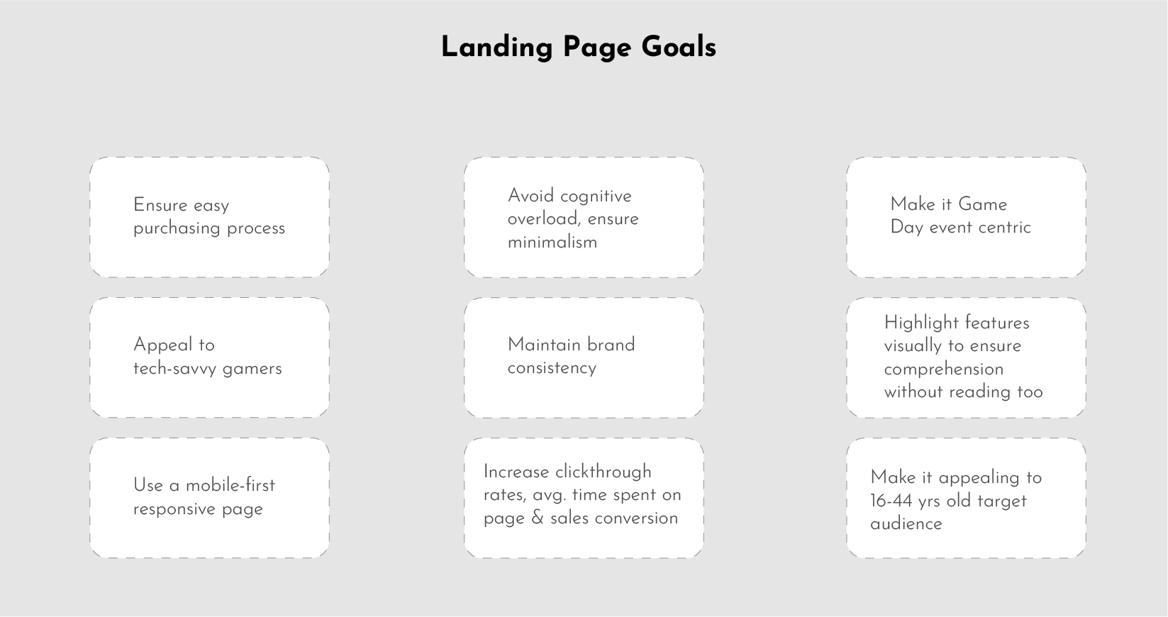
- Defined concise goals for the landing page by analyzing the provided goal by the client, focusing on enticing the target audience to explore and purchase the PS4 Pro during the Game Day event.
Information Architecture:
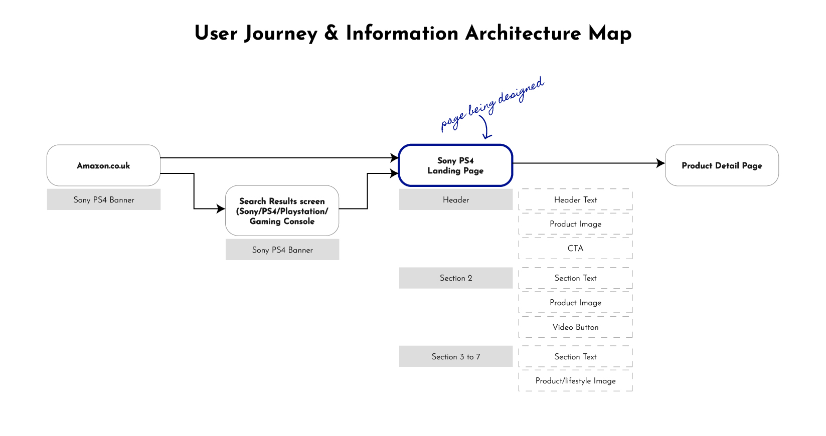
- Identify key content and features to be included in the landing page, such as showcasing unique selling points, attractive visuals, concise product information, and clear calls to action.
- Organized the landing page’s information architecture to create a seamless and intuitive user journey, highlighting product details and the purchase option.
Visual Identity:
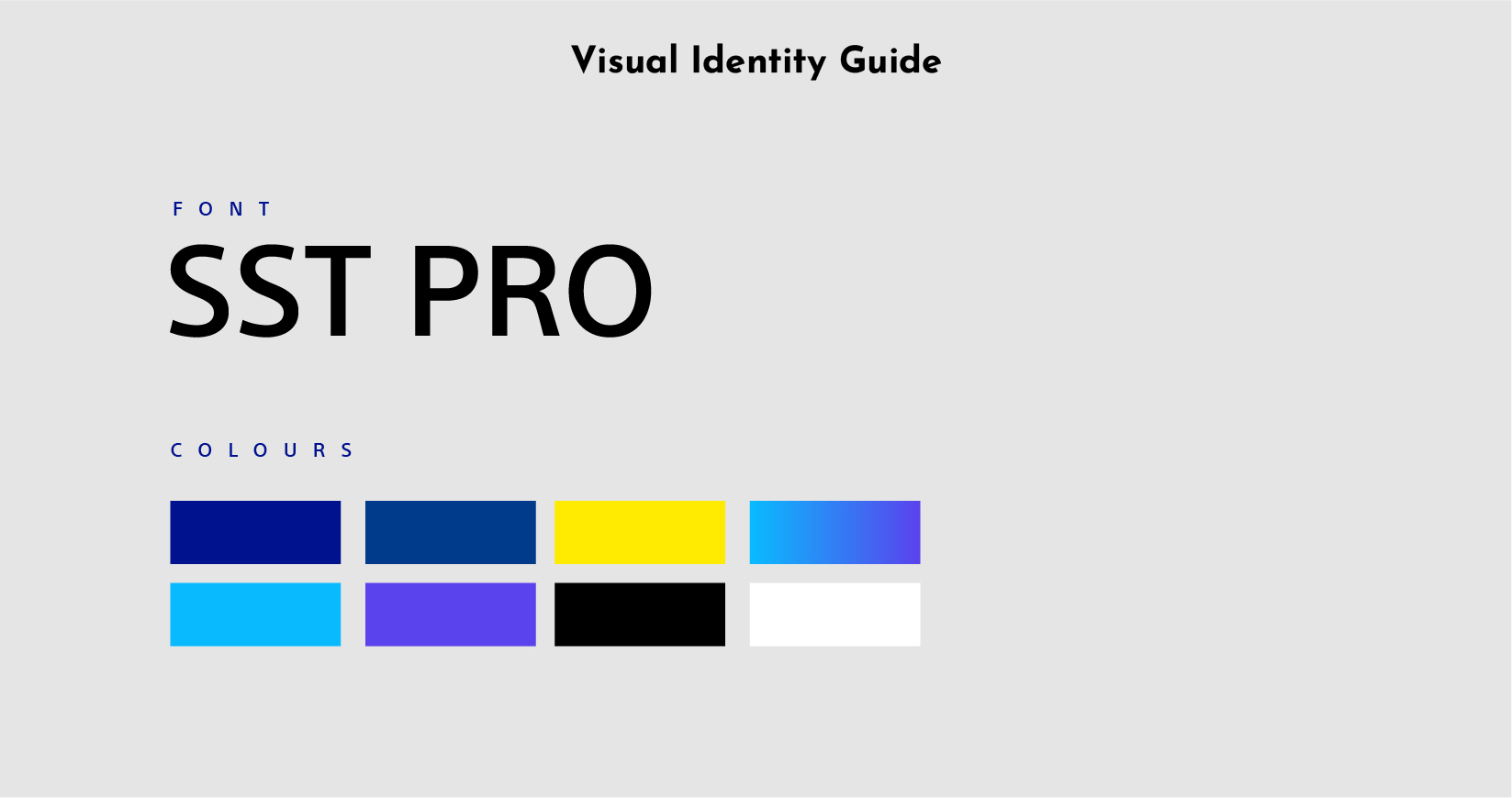
- Established a bold yet minimally balanced visual identity using high-resolution imagery, brand colors, fonts, and a minimal design system to balance showcasing product features and maintaining a visually appealing design.
- Brand font style was selected: SST Pro (brand font of PS4)
- Brand colours were selected: #1553ff (for CTA as used on PS4 website), #fff, #000, #003a8b
- Colour style was defined: Gradients (#09bbfe, #5a42ec) since gradients give a more futuristic look and feel and are liked by our target audience.
Design Approach:
- Prioritize a mobile-first design approach, considering that around 95% of internet users access content via mobile devices.
- Optimize content and layout for smaller screens without compromising the desktop experience, adopting a responsive design framework and a mobile-first mindset for a seamless cross-device experience.
Brainstorming:
- Collaborated with the campaign manager, client, and four other designers to generate a number of ideas.
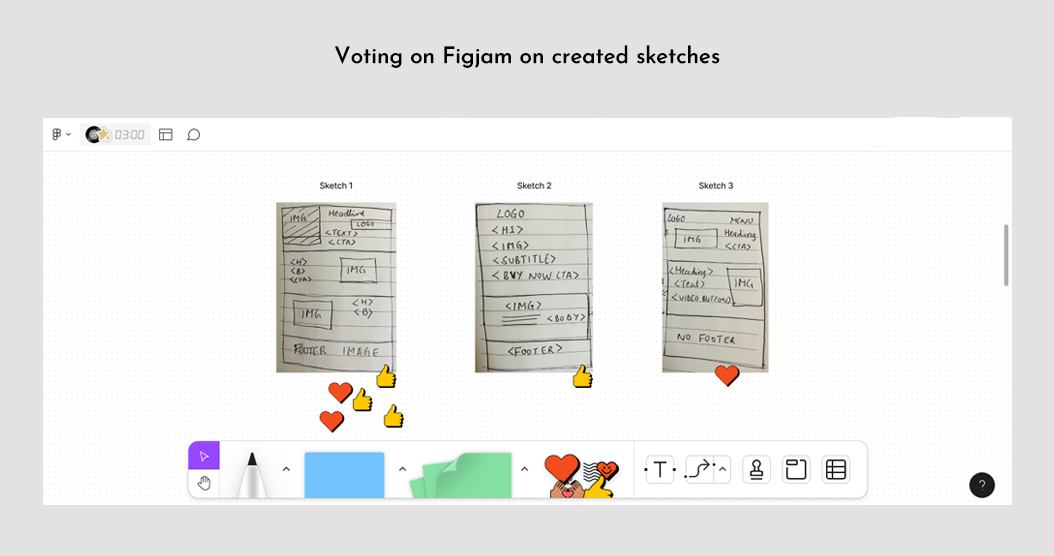
- Conducted voting to select ideas with the most votes.
Ideating the design style based on defined goals:
- Standardized structure, page size, margins, colors, font sizes, and styles
- Developed SOPs on image style for each section, prioritizing sports games to align with Game Day celebrations and visually showcasing the product feature.
Wireframing:
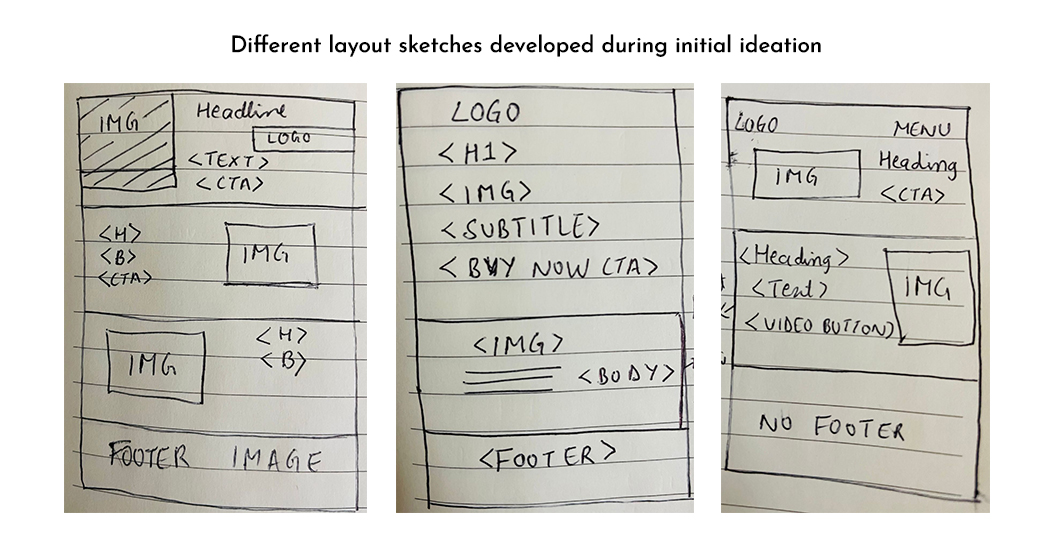
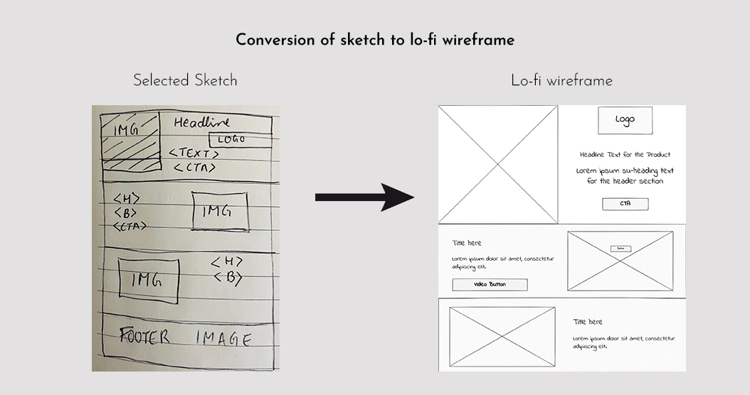
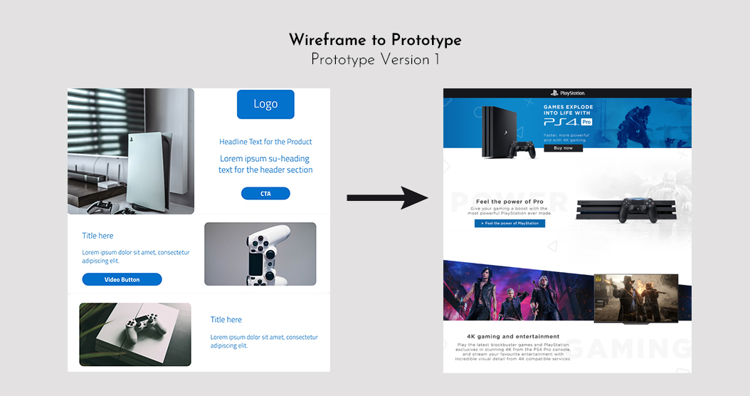
- Sketched initial concepts and wireframes for desktop and mobile versions of the landing page utilizing insights from the empathize phase and Amazon Advertising’s AI-based insights (like bright-coloured CTAs in yellow/orange/pink colour provide a higher click-through rate).
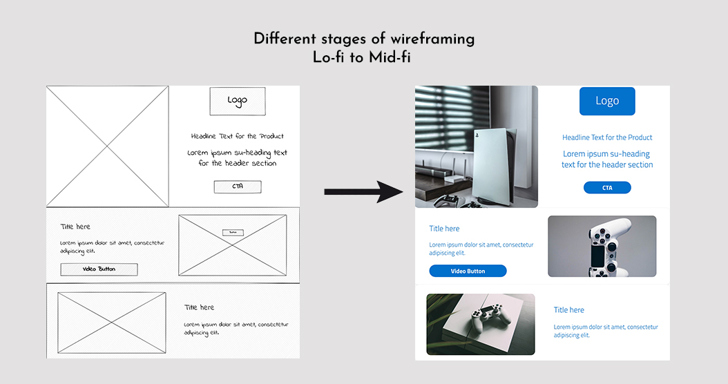
- Explored layout options, prioritized content, and ensured a clean and user-friendly design.
- Conducted voting to select ideas with the most votes.
Sketching and Wireframing During Ideation
Visual Design and Brand Consistency:
- Created visual designs based on selected wireframes
- Subtly integrated Amazon landing page guidelines such as page margins, layouts, the overall sequence of sections of the landing page, and Amazon policy adherence to maintaining brand consistency while leveraging the advertising platform.
Responsive Design and Functionality:
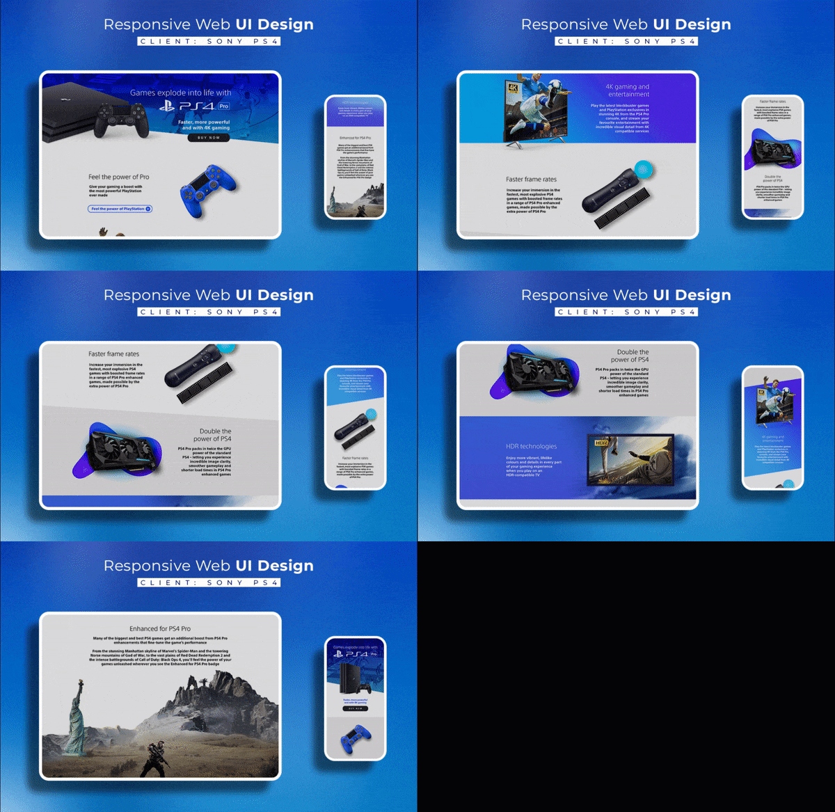
- Designed the landing page to be responsive, ensuring a seamless experience on both desktop and mobile devices.
- The layout and content adapted fluidly to different screen sizes, maintaining readability and accessibility.
User Experience and Information Architecture:
- Implemented the information architecture created during the define stage effectively in the prototype.
- Users could navigate from the landing page to the product purchase page through the CTA and did not require any additional steps.
- The layout prioritized essential content, reducing clutter and cognitive load, resulting in a streamlined user experience.
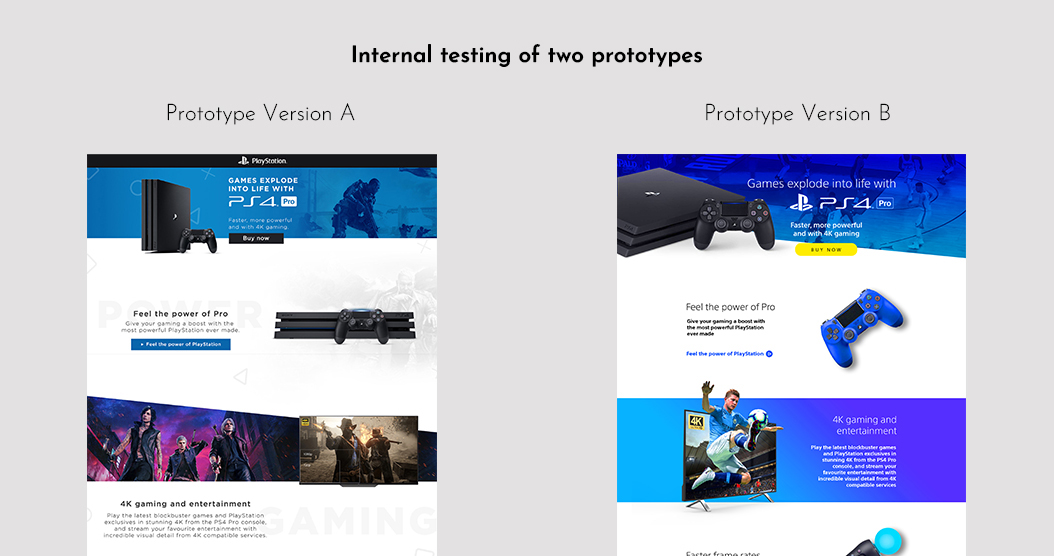
- Designed two versions of the landing page to do internal testing with multiple design teams, campaign managers, client representatives, and some controlled users: one more playful and the other resembling a standard Amazon store landing page design.
Creating Prototypes
Collaboration and Feedback Gathering:
- Collaborated with stakeholders, including creative campaign managers, clients, development team, QA team, equity team, and user testing team, to gather feedback on prototypes.
- Conducted usability testing to evaluate the effectiveness and user-friendliness of the landing pages.
- Conducted internal testing between two created landing page prototypes.
Refinement and Iteration:
- Iterated the selected prototype B design during post-launch user testing based on received feedback, addressing design challenges and refining the final product. The new design was again tested with users to ensure the effective implementation of changes.
Conclusions from the Test Stage:
- Stakeholder Input: Feedback from stakeholders, including visual designers, campaign managers, clients, and engineers, provided additional perspectives and insights to refine the design and ensure technical feasibility.
- Internal testing: During the pre-development phase of the design, controlled user testing with 43 users (gamers and non-gamers) and multiple design teams of Amazon Adops, was conducted between two UI designs, resulting in the selection of version 2 as the design with 83% more design approval and 67% more CTR.
- User Feedback: Gathering feedback from users during post-launch testing provided insights into their experience, preferences, and any encountered usability issues. These were addressed by making a final set of changes to the developed design.
- Engagement and Conversion: Post-launch user-engagement metrics for the iterated landing page for PS4, including click-through rates (increased by 59%), time spent on the page (increased by 87%), and sale-conversion rates (increased by 43%), helped assess the effectiveness of the design in achieving desired goals.
Testing the design
The logic behind using various elements in the design
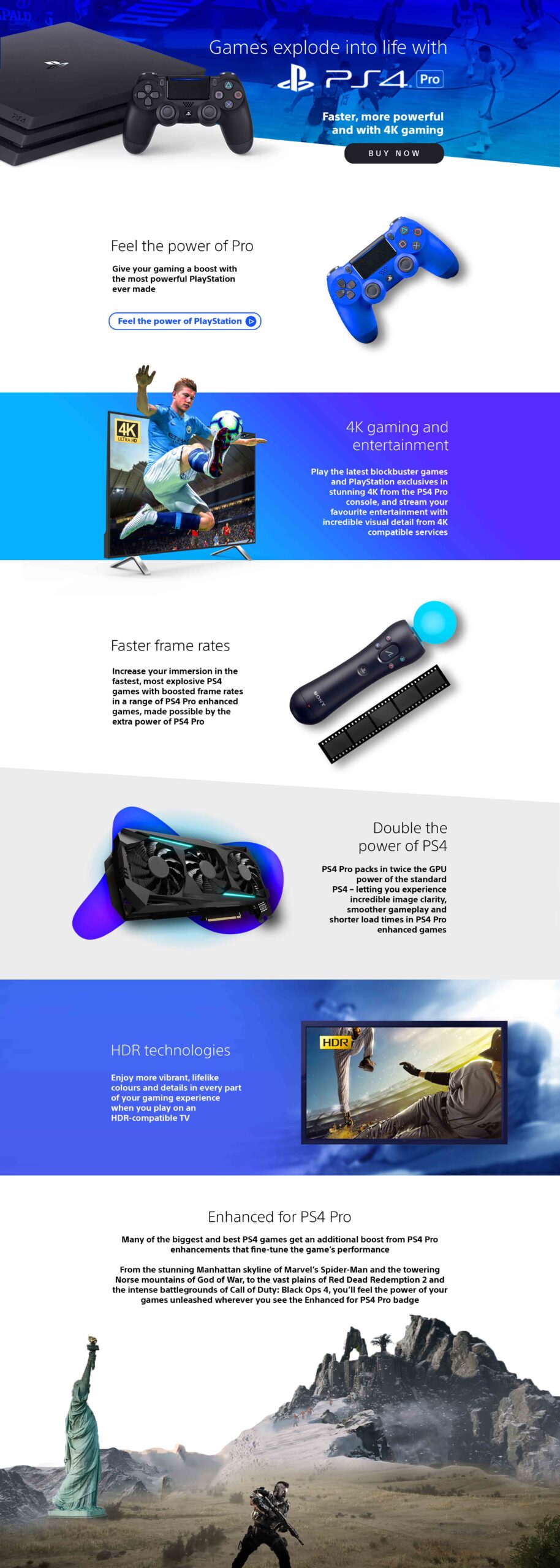
Main fold of the landing page
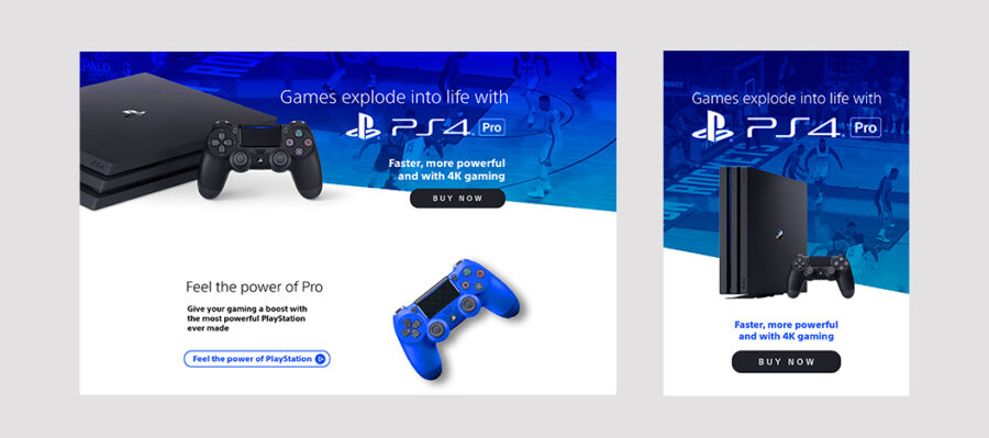
- The console and controller (the main products) are highlighted foremost in the header
- The Buy Now button with a different, darker color creates emphasis on the CTA, highlighting the button and following the brand colors of PS4 at the same
- ‘The slant in the edge of the banner background’, ‘gradient overlay on the banner background’, and ‘button lying partly on the banner background and party on the white webpage background’ gives a modern playful design look as preferred by our target audience.
Section 2
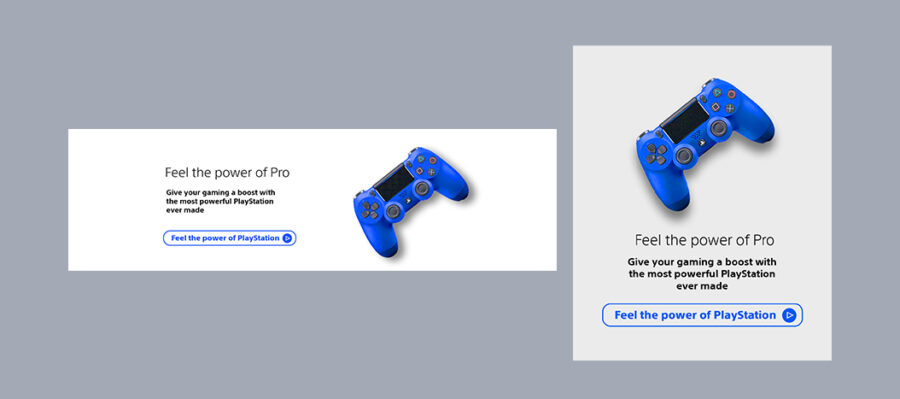
- This section is also visible on the main fold on desktops. While providing the secondary CTA ‘Feel the power of PlayStation’ this mandatory second CTA is combined with the first product feature text since the CTA and heading of the first product feature are similar and would make sense together.
- Against “Feel the power of Pro”, a powerful blue-coloured controller has been positioned, to to keep the colour consistent with the brand theme while also providing a bold look to the brand.
- The video button would redirect the user to the video of PS4, the video icon makes sure the user understands that they will be redirected to the video
Section 3
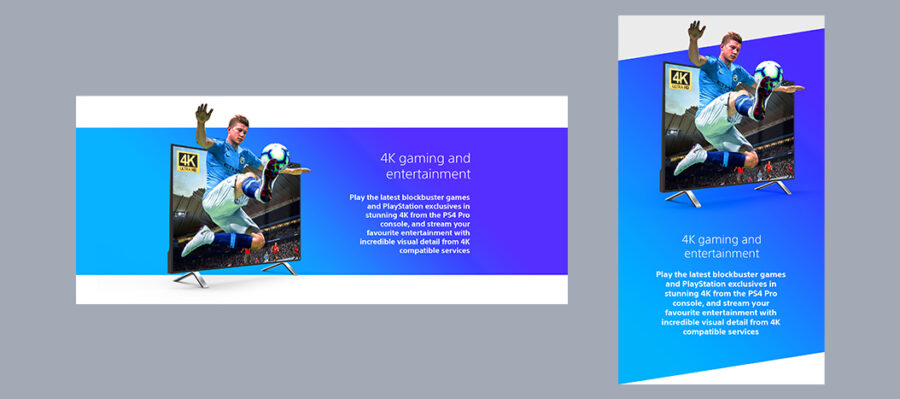
- This section talking about the improved picture quality has been highlighted with a coloured background to make sure the user’s focus is captured to this important enhancement, which is a USP of PS4.
- A high quality picture is used, emphasising the 4K quality which will make user envision the games in such a way that they have been brought to real life. For this purpose, the footballer is made to pop out of the screen, relaying the essence of coming-to-life because of 4K technology. The picture used is of a football game, utilising the essence of Game Day.
Section 4
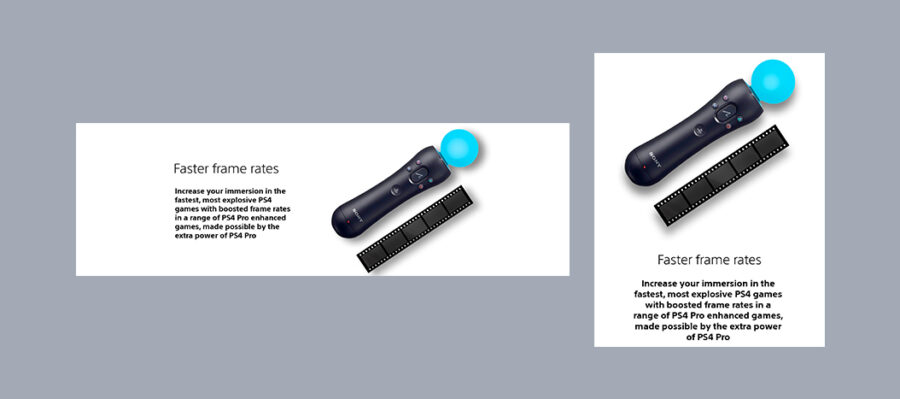
- This section talks about a higher frame rate and hence the traditional video frames of a reel are showed to highlight this messaging visually paired with a modern PS4 Move.
- This image of PS4 Move also highlights another product offering by PS4 which can be bought by the user. This joystick also creates an excitement in the mind of the user by capturing attention of tech savvy gamer target audience.
Section 5
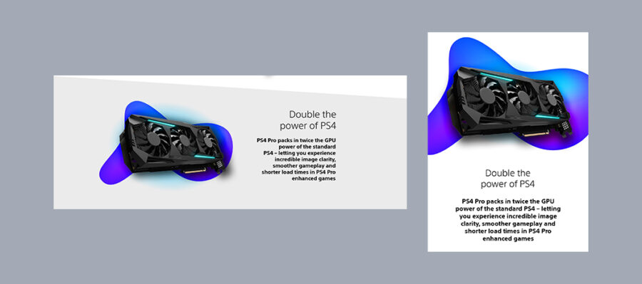
- Being tech savvy, our target audience also likes to buy new tech products based on their internal technical specifications. The image of the GPU used here ensures that the user understands GPU power has been increased.
- This section also balances out the picture with a bold coloured liquid gradient patch (consistent with brand colours) to excite the gamer target audience and deviate from a more nerdy look. The left bottom beak of the liquid gradient patch also resembles the beak of the controller of PS4.
- In mobile version of the design, this liquid gradient patch also works as a section divider.
Section 6
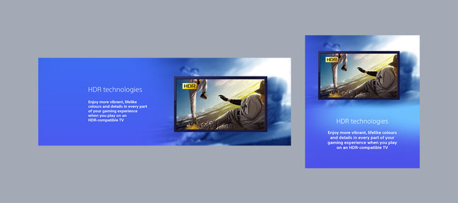
The blurred image in the background and the crystal clear image inside the TV screen emphasizes the stark difference the HDR technology is going to provide to the picture quality.
Section 7
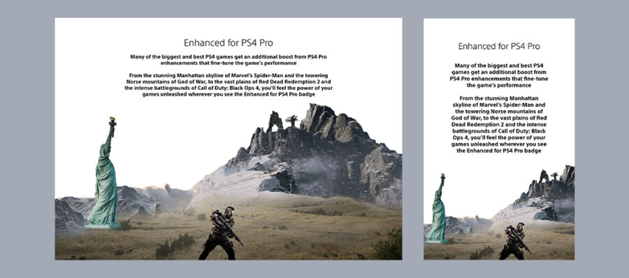
The concluding graphic of the last section is a collage art of the four scenes of the games mentioned in the corresponding copy.
- Statue of Liberty from ‘the manhattan skyline of the game spider man’
- Yellow ground from the ‘vast plains of Red Dead Redemption 2‘
- The soldier from ‘intense battlegrounds of Call of Duty: Black Ops 4’
- Mountain structure from ‘Norse mountains of God of War’
This section ends with a straight line and provides a conclusion to the landing page.
Desktop UI
Mobile UI

Want to showcase my artwork? Want a custom design?
Drop me a line, I’d love to talk.
© god is a designer


