



Sony PlayStation 4
A mobile-first landing page for the PS4 Pro's UK Game Day launch, built to sell on Amazon.co.uk to a 16–44 audience.
Sony wanted a mobile-first responsive landing page to promote sales of the PS4 Pro, targeting 16–44 year olds. It had to integrate with Amazon.co.uk and leverage the Game Day sale event in the UK.
Challenges
- A landing page that drives sales
- A seamless experience on both mobile and desktop devices
- Dense product information without causing cognitive overload
- Needs to be engaging to a 16–44 year-old audience
- Designed around the Game Day event, where gaming products compete hard for attention with aggressive offers
Researched the brand
Analyzed PlayStation's own site and the PS4 product page on Amazon to understand visual style, messaging, and key features.
Researched Game Day
Identified the thematic mood of the target audience during the Game Day event, and whether it would actually help drive sales — leveraging a nationally celebrated day built around games.
Researched competition
Ran a visual analysis of Xbox and Nintendo's UK landing pages and gaming product pages.
User research & target audience
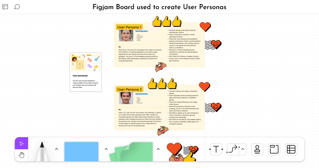
Studied market research, articles, and customer feedback from previous PlayStation and Amazon product pages to build personas and an empathy map for the 16–44 audience.
Male
Skews male, but a meaningful female audience too.
Female
Not a niche to design around as an afterthought.
Mobile-first
Young, tech-savvy UK gamers who browse more on phones than desktop.
Tech-savvy, passionate gamers who prefer detailed product info while shopping, want the latest high-performing gadgets, favor clean visual UI, check reviews before buying, love offers and discounts, and want big screens with high-resolution graphics.
Goals
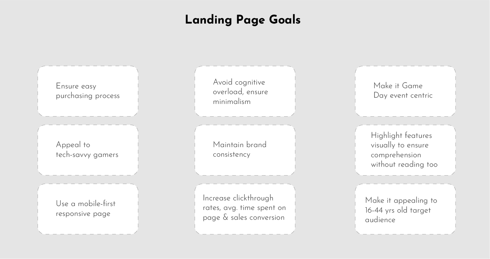
Defined concise goals for the landing page from the client brief, focused on enticing the target audience to explore and purchase the PS4 Pro during the Game Day event.
Information architecture
- Identified key content and features: unique selling points, attractive visuals, concise product information, and clear calls to action
- Organized the page's information architecture around a seamless, intuitive journey to the purchase option
Visual identity
- Bold yet minimally balanced visual identity: high-resolution imagery, brand colors, fonts, and a minimal design system
- Brand font: SST Pro (PS4's own brand font)
- Brand colours: #1553ff #fff #000 #003a8b
- Gradient: #09bbfe → #5a42ec, for a more futuristic look favored by the target audience
Design approach
Prioritized a mobile-first approach — around 95% of internet users access content via mobile — optimizing content and layout for smaller screens first without compromising the desktop experience.
Brainstorming
Collaborated with the campaign manager, client, and four other designers to generate ideas, then voted to select the strongest ones.
Ideating the design style
Standardized structure, page size, margins, colors, font sizes, and styles. Developed SOPs for image style per section, prioritizing sports imagery to align with Game Day and showcase the product.
Wireframing
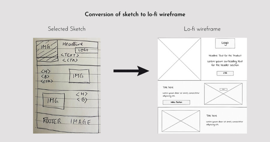
Sketched initial concepts for desktop and mobile, using insights from the empathize phase and Amazon Advertising's AI-based insight that bright-coloured CTAs (yellow/orange/pink) drive higher click-through.
Visual design & brand consistency
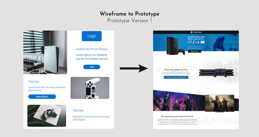
Built visual designs from the selected wireframes, subtly integrating Amazon's own landing-page guidelines — margins, layout sequence, and policy adherence — while keeping the PS4 brand consistent.
Responsive design & functionality
Designed the page to be fully responsive, with layout and content adapting fluidly across screen sizes while keeping readability and accessibility intact.
User experience & information architecture
- Users could go from landing page to purchase through the CTA with no extra steps
- Prioritized essential content, reducing clutter and cognitive load
- Designed two competing versions internally — one more playful, one closer to a standard Amazon store landing page — to test against each other
Collaboration & feedback
Collaborated with creative campaign managers, clients, the development team, QA, equity, and user-testing teams to gather feedback on both prototypes, then ran usability testing between them.
Refinement & iteration
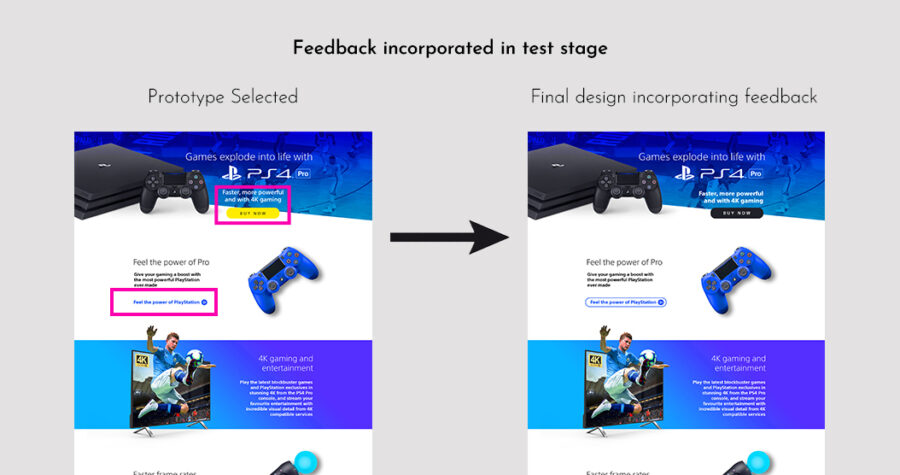
Iterated the winning prototype during post-launch user testing based on feedback, then re-tested the refined design with users to confirm the changes worked.
Conclusions from testing
1. Main fold
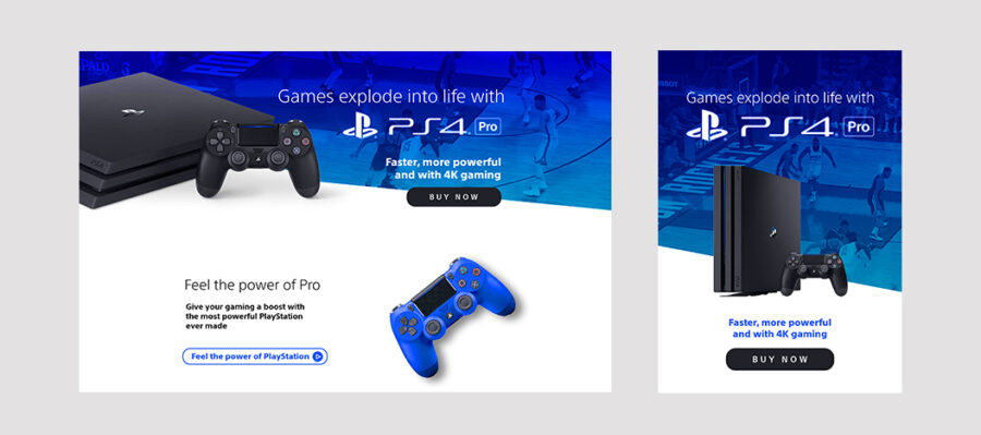
- The console and controller — the main products — are highlighted foremost in the header
- The Buy Now button uses a different, darker color to create emphasis while still following PS4's brand colors
- The slanted banner edge, the gradient overlay, and the button sitting partly on the banner and partly on white give a modern, playful look that matches the target audience's taste
2. Feel the power
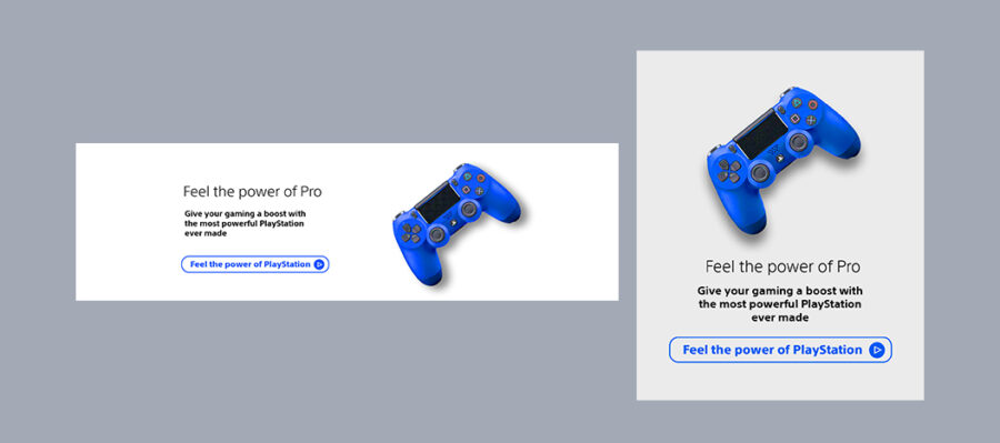
- Still visible on the main fold on desktop. The mandatory second CTA, "Feel the power of PlayStation," is combined with the first product-feature text since the two headings read naturally together
- A powerful blue-coloured controller sits against "Feel the power of Pro" — consistent with brand colour while giving the section a bold look
- The video button redirects to the PS4 video; the video icon signals that clearly before the click
3. Picture quality
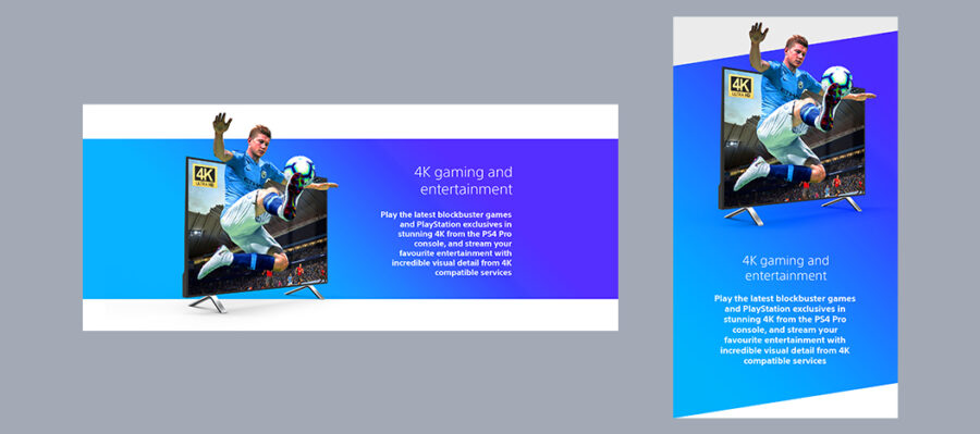
- A coloured background highlights this section, since improved picture quality is one of PS4's core USPs
- A high-quality football image emphasises 4K quality, with the footballer popping out of the screen to sell the "brought to life" feeling — football also ties back to Game Day
4. Frame rate
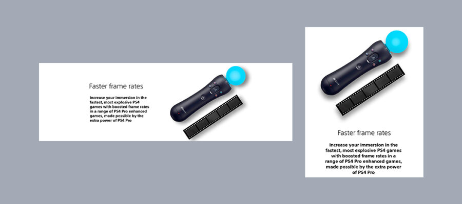
- Traditional film-reel frames visually communicate the higher frame rate, paired with a modern PS4 Move controller
- The PS4 Move image doubles as a cross-sell for another product, exciting the tech-savvy gamer audience
5. Internals
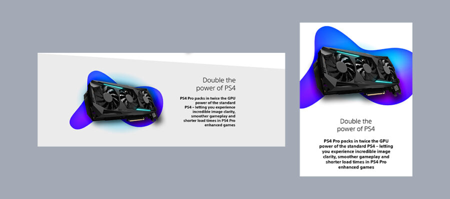
- A GPU image speaks directly to a tech-savvy audience that buys on internal specs, not just looks
- A bold, brand-coloured liquid-gradient patch balances the technical image and excites the gamer audience — its bottom-left beak echoes the shape of the PS4 controller
- On mobile, that same gradient patch also works as the section divider
6. HDR
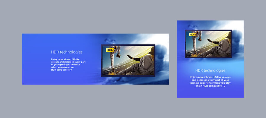
The blurred background against a crystal-clear image inside the TV screen emphasises the stark difference HDR makes to picture quality.
7. Closing collage
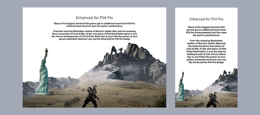
The closing graphic is a collage of four game scenes referenced in the copy:
- The Statue of Liberty, from the Manhattan skyline of Spider-Man
- Yellow plains, from the vast landscapes of Red Dead Redemption 2
- A soldier, from the battlegrounds of Call of Duty: Black Ops 4
- A mountain structure, from the Norse mountains of God of War
The page ends with a straight line, giving the landing page a clear conclusion.
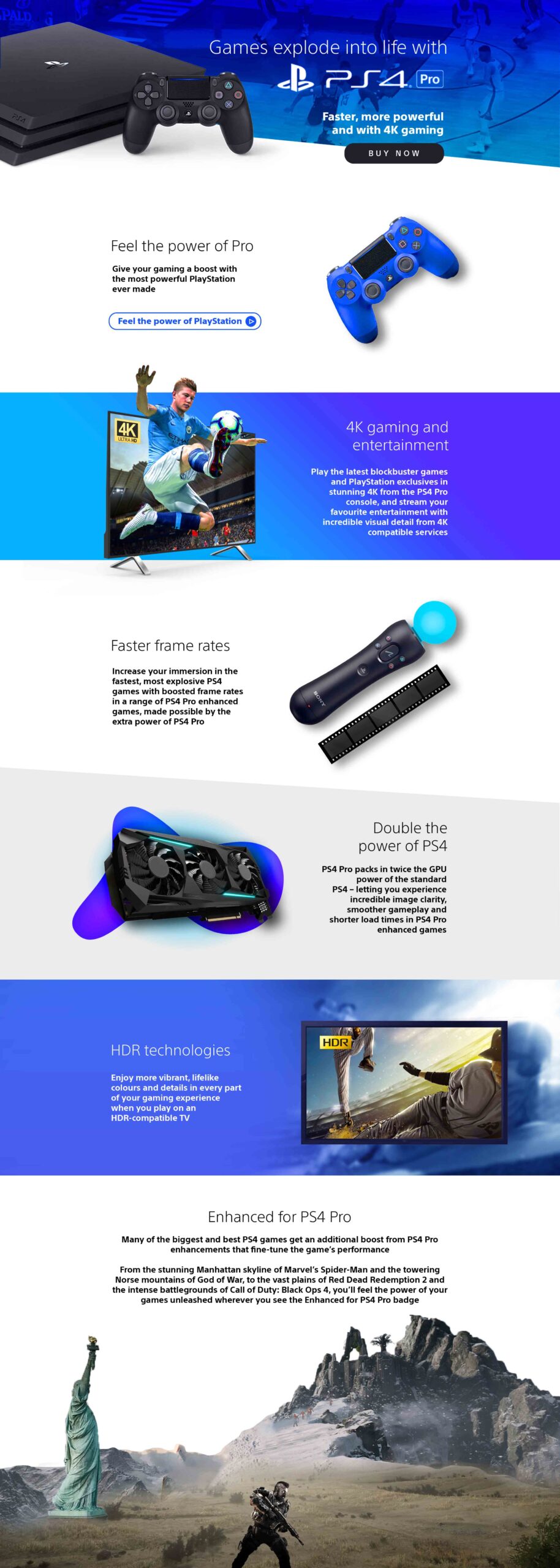

Compared to the equivalent PS3 brand-store landing page on Amazon, the shipped PS4 Pro page was a clear improvement:
Yellow doesn't automatically win as a CTA colour — and a video button can quietly compete with, rather than support, a CTA that's already driving the sale.
Key learnings
- Yellow does not work as the best colour for a CTA in every situation
- Young gamers respond to bold colours and graphics, but it needs to be balanced with minimalism to avoid cognitive overload
- A video button performs better treated as a regular button when a CTA is already driving the sale
- Mobile-first has to be the default approach — roughly 93% of users visit a landing page like this from a phone