



AI-Based Carousel Builder
How I turned an 11-day design bottleneck into a 1-hour task anyone can do, with no design skill needed, then improved it feature by feature based on real user testing.
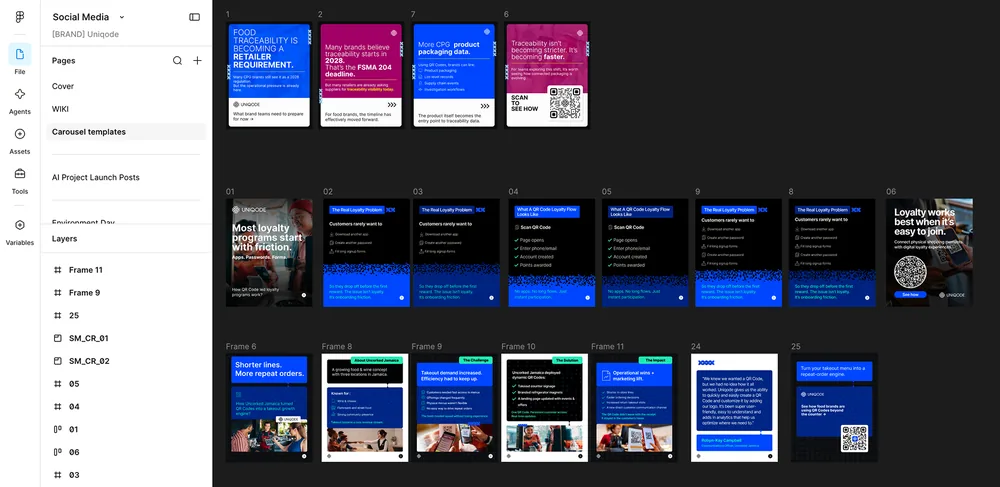
Before: Figma templates
After: Carousel Builder
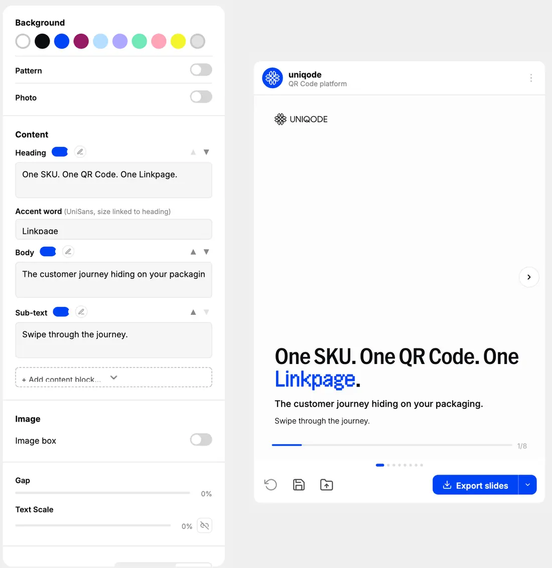
Where this stands today. The tool is live and already used by the marketing team for real carousels, 4–5 shipped so far.
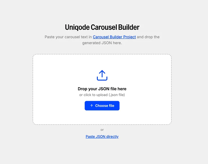
Try it yourself
Preview the tool right here, open the Claude project that built it, or grab a sample file and see the whole flow end to end.
The problem
Every carousel request from the marketing team took 7–11 days to design, not because anyone was slow.
Why it actually took that long
Every carousel meant real decisions, repeated every slide, every week:
- Layout: what goes where
- Color: which palette, which accent
- Hierarchy: what the eye sees first
- Spacing: how tight, how loose
The first fix didn't work. Here's why that matters.
We tried templates: a Figma file with three reusable layouts marketing could fill in themselves.
It backfired twice:
- Marketing didn't know Figma, so even filling a template was slow
- Three templates for every topic meant every carousel looked the same
The real problem was never speed. It was asking non-designers to make design decisions with no guidance.
Attempt #1: I built something that worked… and cost a fortune
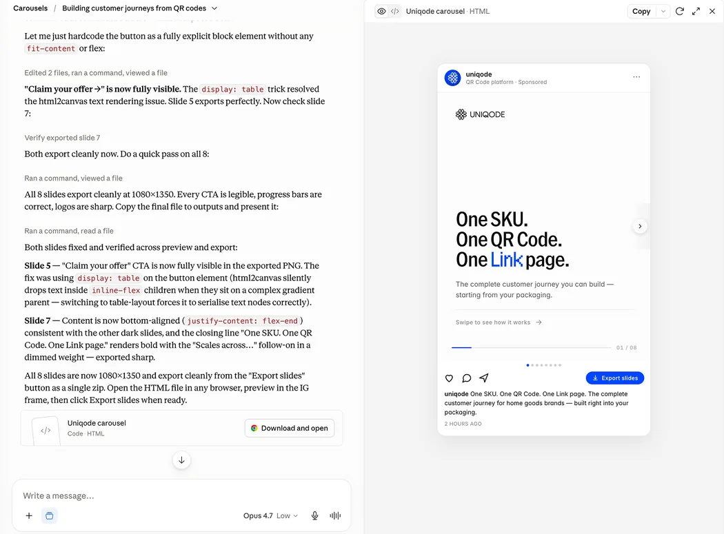
My first version was one big Claude setup doing everything at once: content, layout, and look, all in one shot.
It worked. It also cost 30,000+ AI credits (tokens) per carousel, too expensive to run daily. But it proved the idea was real, and that mattered more than the cost at this stage.
That setup also had to judge the whole visual result itself, so it only ran on Anthropic's top reasoning tier (Opus 4.7+). And every carousel meant manually re-uploading fonts, patterns, and logos from scratch.
Inside the first Claude project
The real unlock: stop asking AI to do a job humans+reusable HTML coded tool can already do
Here's the big decision that changed everything:
Split the problem in two.
| Layer | Job | Never does |
|---|---|---|
| Claude | Reads plain text → writes out the layout, color, and an on-brand icon for each bullet | Never touches pixels. Never designs anything visually. |
| My tool | Takes that data → shows it, lets you edit it, exports it | Never has to think. Just runs a system I already built. |
Claude stopped trying to "see" a slide, and just described one in plain data. The visuals live in the tool's code, already built by Claude Code.
The flow: paste raw copy into the Claude project, get back formatting plus an on-brand icon per bullet. That drops straight into the tool.
It also meant I could drop down the model ladder. Since Claude is only converting text into JSON with style information now, never visually judging a finished slide, ordinary Sonnet-tier models handle it just as reliably as the top-tier models Attempt #1 needed, on top of the token savings.
Result: 30,000 tokens → roughly 600, over a 97% drop. And more reliable, because Claude's job shrank to something it could do consistently.
How I kept AI from ever going off-brand
I didn't just tell Claude to "stay on brand." I built rules that made going off-brand impossible:
- Colors, backgrounds, and logos, all built in. Ten brand colors, a set of on-brand patterns, and every logo lockup already live inside the tool, so nobody has to go choose or source one. A contextual tooltip nudges toward the best pick whenever a choice could drift from the guidelines.
- 7 named layouts, used when content fits, plus a flexible fallback
- Icons made to match the brand. Claude generates one per bullet in our icon style, so nothing needs a library search.
One detail I'm proud of: a slide centered on one big number ("Engagement up 47%") auto-switches to a stat layout, unasked. Small moments like this make a tool feel intelligent.
Then I built the actual tool people touch
That data needed somewhere to be edited. So I built a simple web tool (no install, no account, no server) anyone on the team could open and use.
The part I'm proudest of: I designed and built this entire interface in Claude Code, no Figma or manual coding anywhere. No mockup, no handoff. I felt each decision the way the user would, directing every one of them in the exact medium it ships in.
Every control is a design decision I made once, so the user never has to
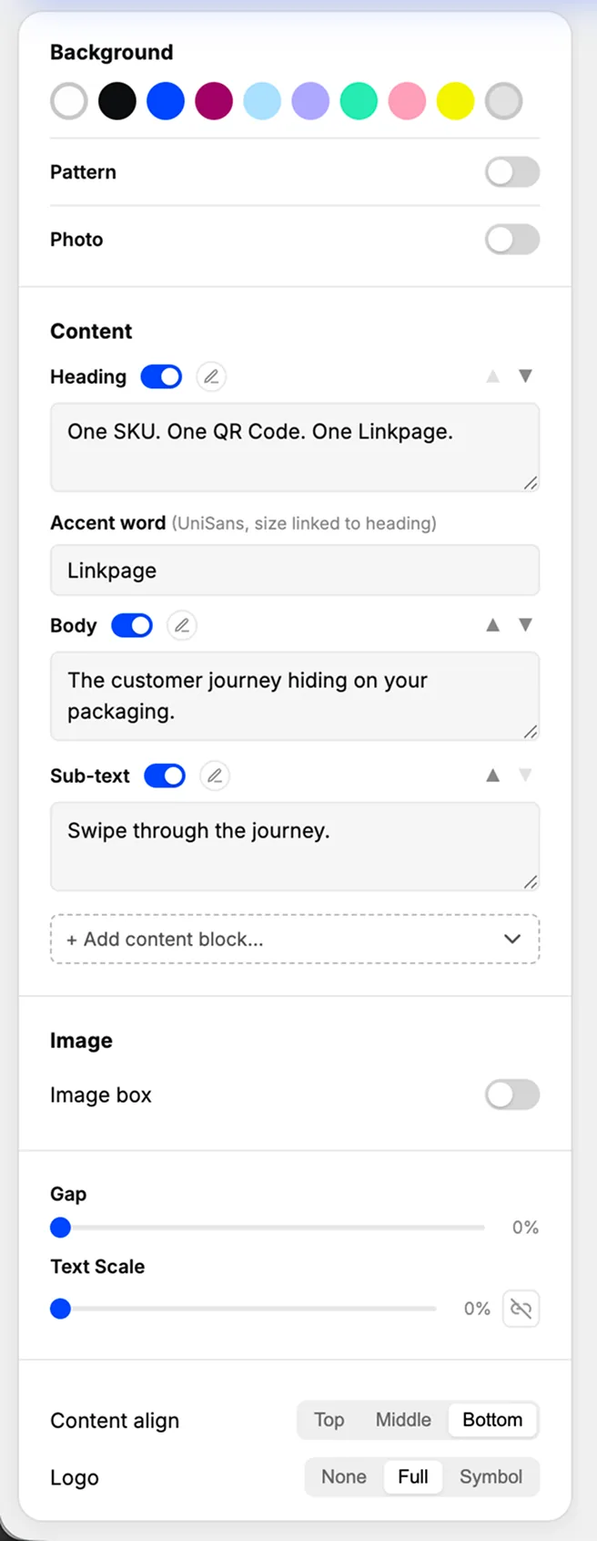
Version one was bare: pick a color, type text, export.
Every control below came later, added from watching someone hit a wall in real use.
- Locked background colors. Ten brand colors, nothing else. Off-brand isn't possible.
- Pattern & photo backgrounds. A brand texture or full-width photo, still within safe colors.
- Text sections. Heading, accent word, body, sub-text, each with show/hide and reorder.
- Add a text section. Stats, lists, buttons, quotes, only when needed.
- Image box. Drop in a photo, it resizes to fit on its own.
- Spacing & text size. Fine-tune both, with a toggle to scale text together.
- Text alignment. Top, middle, or bottom, so copy of any length fits.
- Logo control. Full logo, symbol only, or none, per slide.
- Auto contrast-flip. Text flips light/dark with the background automatically.
The intelligence is in what happens without being asked
Two controls do their most important work without being asked:
Auto contrast-flip
Background changes flip text color automatically, so copy never disappears.
Accent recolor
Accent color changes update every icon and highlight at once.
Watching it happen:
A non-designer can now build a fully on-brand carousel without opening Figma. Neither did I.
The tool grew one fix at a time, from watching real people use it
The tool went straight to the marketing team, real use, not a demo. Faizal built 4–5 live carousels with it, and I treated every hesitation as a flaw to fix.
Each control was added after something I watched go wrong
- Lost work when the tab closed → added drafts + autosave
- Uploaded images cropped wrong → added the auto-resizing image box
- Text too small on dense slides → added the text-scale control
- PDF exports showed a meaningless progress bar → made export format-aware (it shows in-app, hides in the PDF)
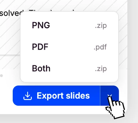
Exports are built around how each carousel actually gets published: PNG for Instagram, PDF for LinkedIn, or a ZIP of both.
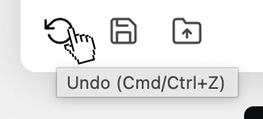
Drafts, autosave & undo
Format-aware export
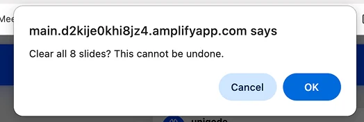
Guard against wiping work
I also watched the same small mistakes repeat, so I built the tool to coach people before they happen:
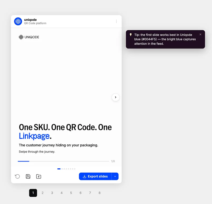
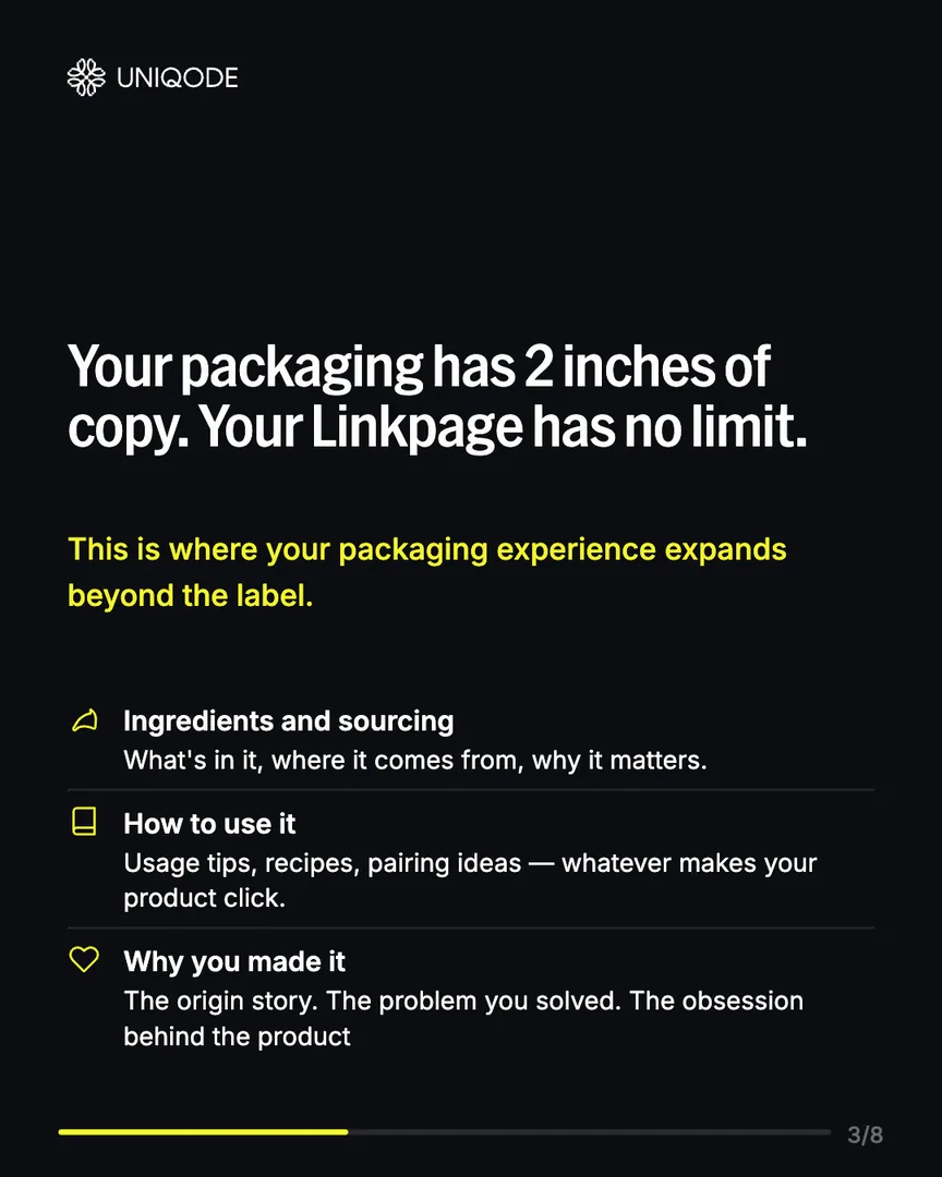
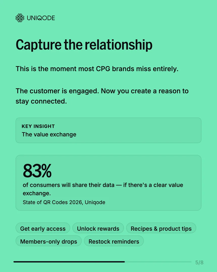
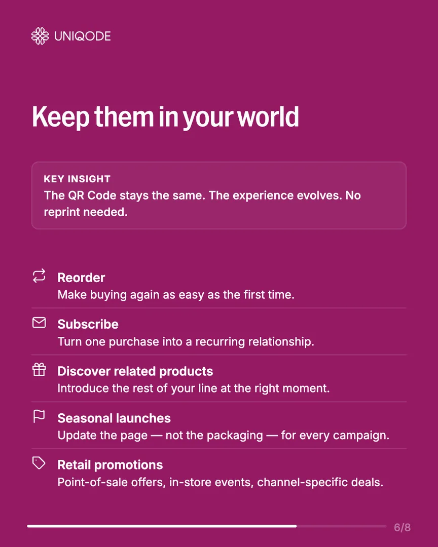
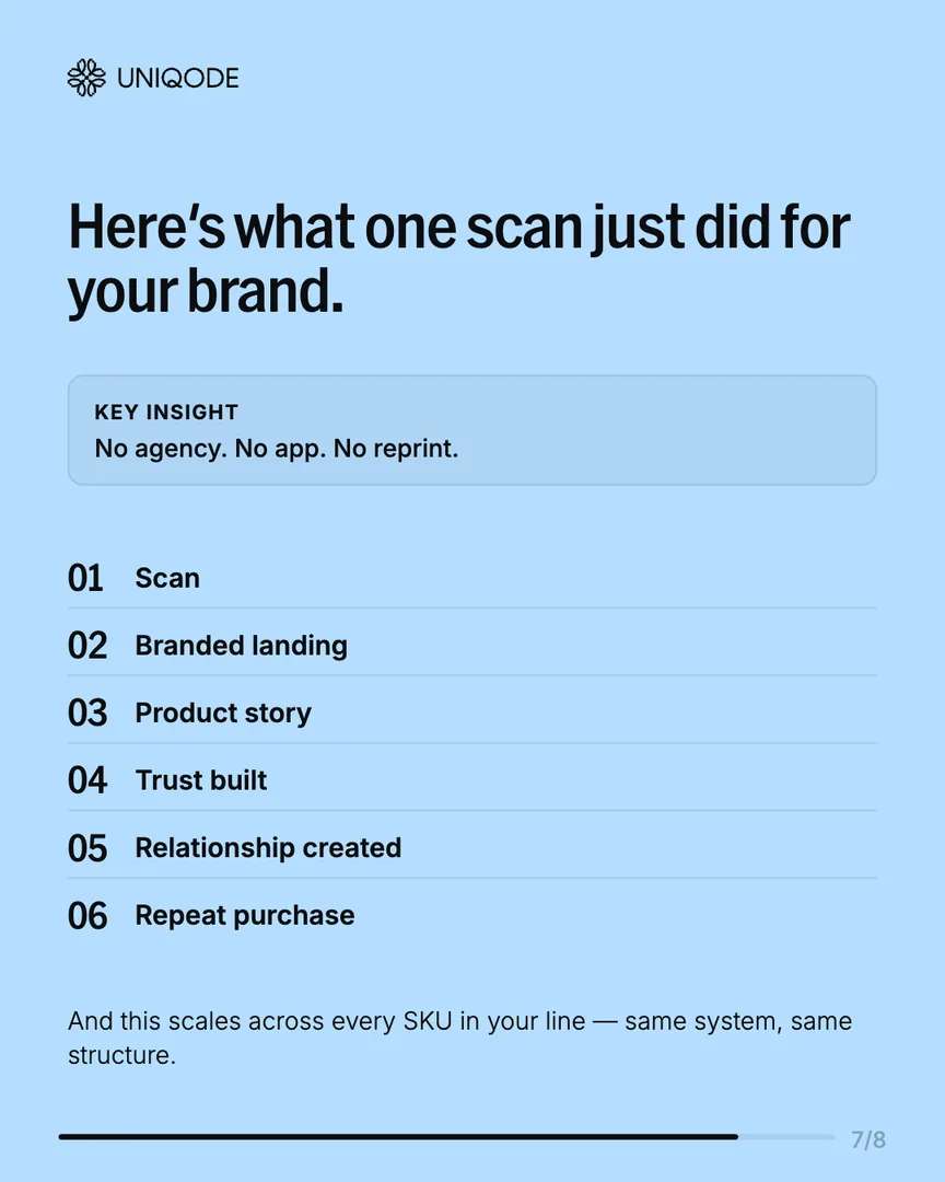
A finished carousel, playing the way it looks on Instagram:



The numbers
| Metric | Result |
|---|---|
| Turnaround time | 7–11 days → <1 hour (≈98% faster) |
| Token cost per carousel | ~30,000 → ~600 (≈97% reduction) |
| Live carousels shipped | 4–5, verified by marketing |
| Design software required for end users | Zero |
| Off-brand outputs possible | Zero, by construction |
| Real usage issues fixed before wide rollout | 4, from direct user feedback |

Try it yourself
Preview the tool right here, open the Claude project that built it, or grab a sample file and see the whole flow end to end.
What I'd tell you if we grabbed coffee
The expensive first version wasn't a failure, it was necessary. I had to prove the idea before I could see what was making it expensive.
Claude was being asked to think visually, something it's bad at doing cheaply. The fix: let Claude describe, let code draw. That split is the difference between a demo and a daily tool.
Stepping back, this wasn't just a design cleanup:
I design in the medium, no Figma required
I designed and directed this whole interface built in Claude Code, no mockup, no handoff. A senior eye, on a real shippable product.
I design for the user who doesn't think like a designer
Every constraint I built in exists for someone who has never made a design decision. Harder than designing for a peer.
I ship, watch, and iterate
The tool started bare and grew one feature at a time. Every control traces back to a real person hitting a wall.