Accessible status indicators
Every status uses color, icons, and labels for clarity.




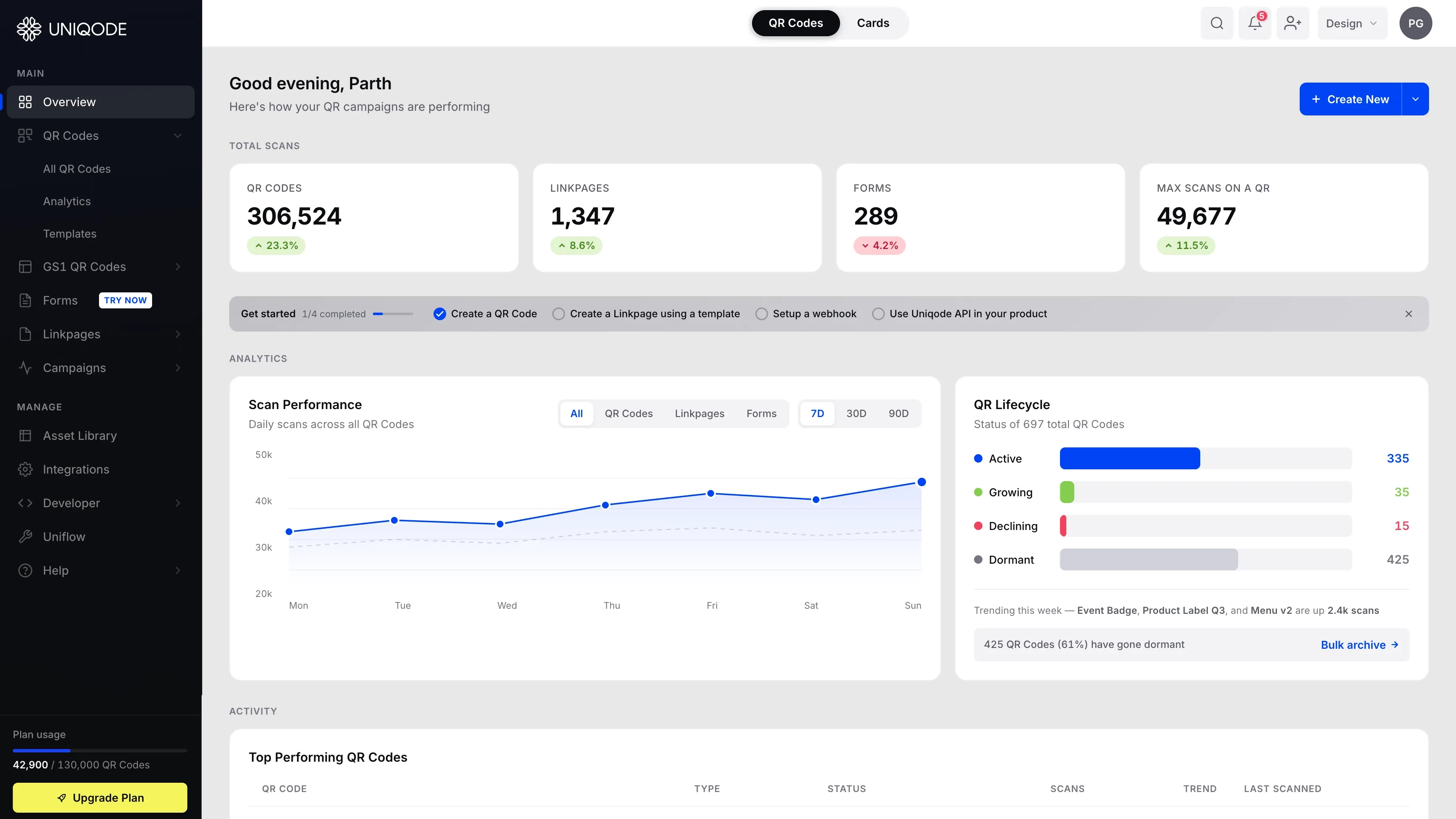
I took Uniqode's flat dashboard and rebuilt it as a layered surface that's easier to scan at a glance. It shows the right data at the right time. It guides new users through setup. And it makes the primary action impossible to miss.
Context: Uniqode is a B2B SaaS platform for creating, managing, and tracking QR codes, linkpages, and digital forms. The dashboard overview is the first screen every user sees after login.
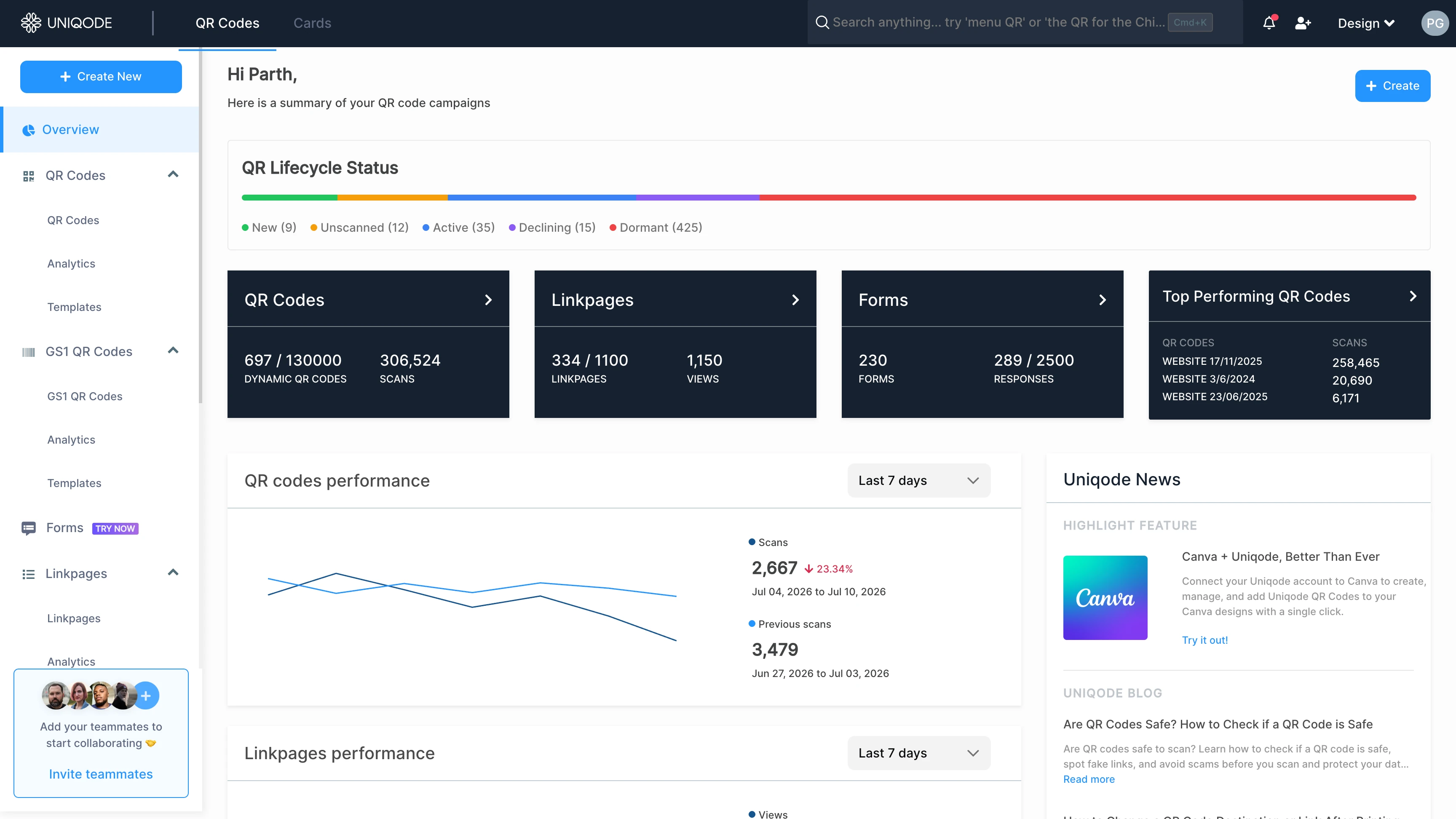
The dashboard's outdated design made it hard for users to find important information, discover key features, or know when to upgrade or renew.
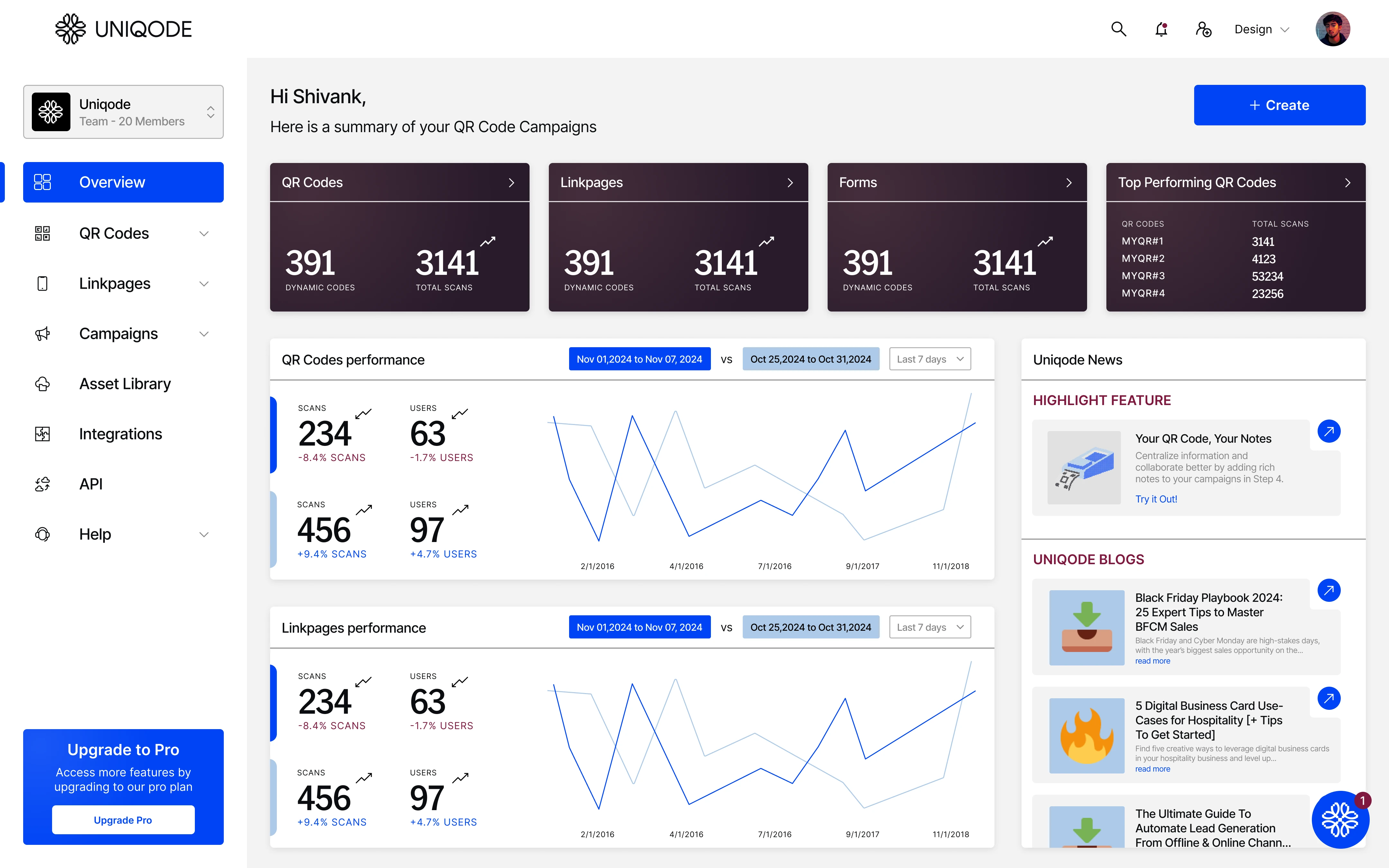
Before: Original Dashboard
After: Redesigned Dashboard
Before changing anything, I mapped every element on the old overview page. For each one, I asked one question: does this earn its space? I checked three things:
That audit, plus everything added along the way, comes down to one table: every element from the old dashboard, what happened to it, and why.
| Element | Actionable? | Unique? | Right place? | Status | Detail |
|---|---|---|---|---|---|
| Uniqode News panel | Removed | Content marketing on a product page. Space reused for the Activity table. | |||
| Invite-teammates sidebar promo | Removed | Useful once, then permanent clutter. Folded into onboarding. | |||
| QR Lifecycle Strip (3 cards) | Removed | Converted into the QR Lifecycle card in the new dashboard. | |||
| Scan / Linkpage / Form performance tiles | Combined | Three tiles became one chart with a product filter. | |||
| "Top Performing QR Codes" tile | Expanded, moved | Was a small summary tile. Now a full table at the bottom. | |||
| Create button | Streamlined | Used to open a "choose a type" screen. A split button skips it now. | |||
| Product toggle (QR Codes / Cards) | Fixed | The underline looked like it floated below the nav bar, easy to miss entirely. Now a solid pill: people can actually see that switching between the two dashboards is possible. | |||
| Search box | Changed | Wide box that opened a full-screen overlay anyway. Now a single icon. | |||
| KPI tiles (4 cards) | Kept | Unchanged; section label now reads "Total Scans." | |||
| Sidebar navigation | Kept | Fixed 240px, unchanged. A collapsible version was tried and dropped, width was never the actual problem, so there was nothing here worth fixing. | |||
| Sidebar nav sections | Changed | Only QR Codes expands by default. No more scrolling. | |||
| Onboarding stepper ("Get started") | Added | 4-step card with descriptions and a visible close icon. | |||
| Plan usage + Upgrade button | Added | Usage visibility, plus upgrade CTA logic tied to plan and payment state. |
The pattern across all of it: remove redundancy (Uniqode News, the QR Lifecycle Strip), cut friction from the primary action (the Create button), and add what's missing (onboarding, product-level filtering, plan visibility). Everything else was polish.
24% upgradedclicked straight through the in-context Upgrade button
A usage bar plus an Upgrade button that disappears at the top plan, and switches to "Update payment method" if a card's expired, protecting retention instead of nagging.
Before this, an expired card just silently failed to auto-renew. Customers only found out when they went looking to manually renew it, and that gap gave them time to shop competitors before deciding Uniqode was still worth the money. That delay was quietly costing us renewals.
Asking people to update their payment method before the plan lapsed changed that: their subscription stayed active the whole time, so there was never a window to reconsider. 80% of people who saw the "Update payment method" button clicked it, and dropout from expired-card churn fell sharply. Of the people who instead saw the healthy-card Upgrade button, nearing their plan limit, 24% upgraded their plan directly from it.
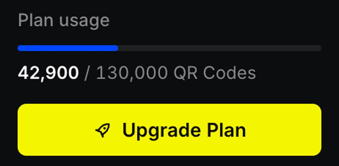
Usage nearing the limit
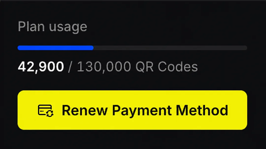
Payment method expired
+33% retentionin the pilot group vs. the group that didn't see it
Four steps, each with a short description, a clearly visible close button for anyone who'd rather skip it, and auto-dismiss once finished.
Tested as a pilot before a full rollout: 70% more users explored all four featured actions (create a QR Code, create a Linkpage, set up a webhook, use the API) than users who never saw the card, and that group's retention came in 33% higher than the control group.
The onboarding card

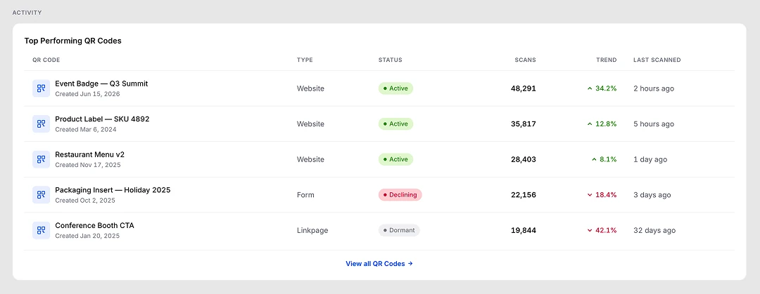
54% interactedwith the table after it shipped
"Which of my QR codes is actually working?" was a recurring support complaint, first-time visibility into your best performer, especially a brand-new campaign, simply didn't exist on the daily overview. See which codes are performing without leaving the page to dig through a separate report. Placed at the bottom so it doesn't crowd out the daily-glance data above.
54% of users shown this table interacted with it, sorting, scanning, or clicking into a code, direct evidence the visibility gap was real.
The table, at the bottom
67% fewer complaintsabout not finding features in the left nav
Only "QR Codes" expands automatically now. GS1 and Linkpages start collapsed, so the sidebar fits without scrolling.
Fewer sections fighting for attention means people are more likely to actually notice and open the ones they haven't explored yet. Support tickets citing "can't find X in the sidebar" dropped 67% after this shipped.
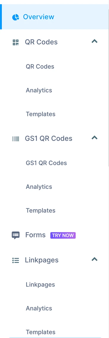
Before
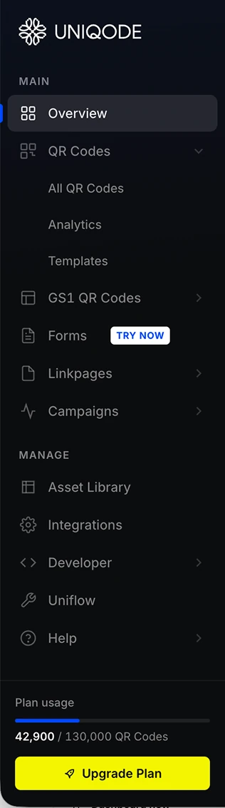
After
10% fasteraverage time from click to a created QR code, linkpage, or form
Creating anything used to open a separate screen just to pick a type. A split button, QR Code, GS1 QR Code, Forms, Linkpages, skips that screen entirely, cutting the average creation time by 10%.
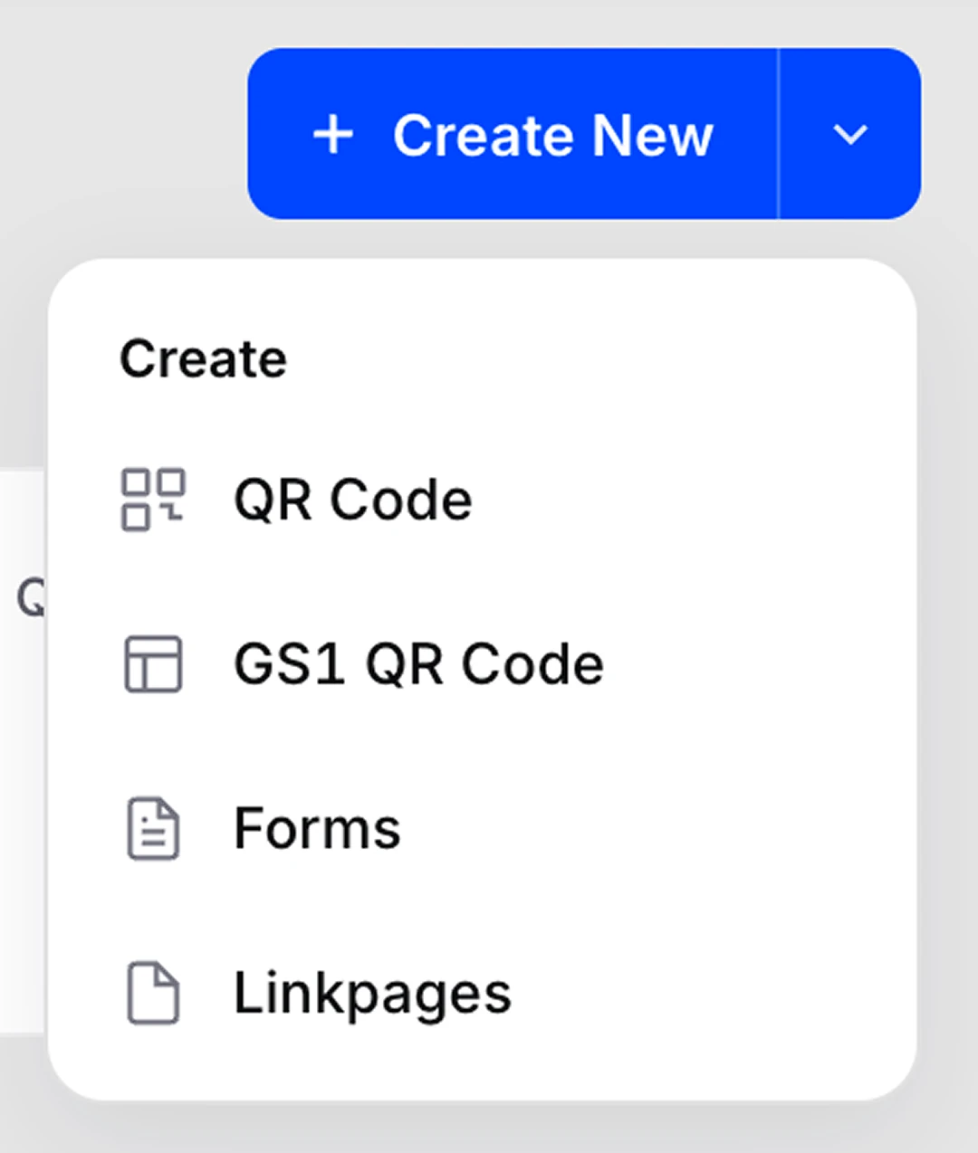
The split button, open
21% adoptedbulk archive since it piloted
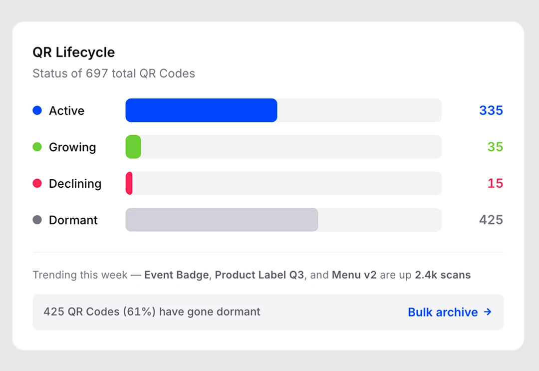
The old QR Lifecycle Strip, now the Lifecycle tile, was read-only: it told you codes had gone dormant but gave you nothing to do about it. Bulk archive was one of the most requested features from customers, so it's the first action we added. 21% of users have used it since the pilot.
A smaller, secondary change came along for the ride: the color palette went from five competing colors down to four, each mapped to something intuitive, so the data reads faster.
Before

After
The original dashboard missed basic accessibility standards: low contrast, small text, and poor keyboard support. The redesign follows WCAG 2.1 AA from the start.
Accessibility isn't just for people with disabilities. It helps anyone who's tired, distracted, using a keyboard, or working in less-than-ideal conditions.
Every status uses color, icons, and labels for clarity.
Meets WCAG AA (4.5:1) for readable text.
Every action works without a mouse.
Buttons have clear, descriptive labels.
16px body text for comfortable reading.
Larger touch targets reduce missed clicks.
Better accessibility means a better experience for everyone, not just people with disabilities.
Not every idea made it. Some were smaller tweaks tried and reverted within this redesign. Others were entirely different directions for the whole dashboard, built and tested before this version won out:
Two smaller tweaks, rejected fast:
A full icon-only collapsed state, technically fine but cramped. A fixed 240px sidebar earns more clarity.
Tried above the KPI tiles first, but they already show per-product data. The filter only makes sense on the chart.
Explored fully in Figma as part of the rebrand. Shelved for now, likely a future theme for younger audiences.
Frosted glass tried on the topbar; blur hurt readability against real content. Reverted to solid white.
Explored first in Figma, before any of it went live:
Footer: redesign exploration

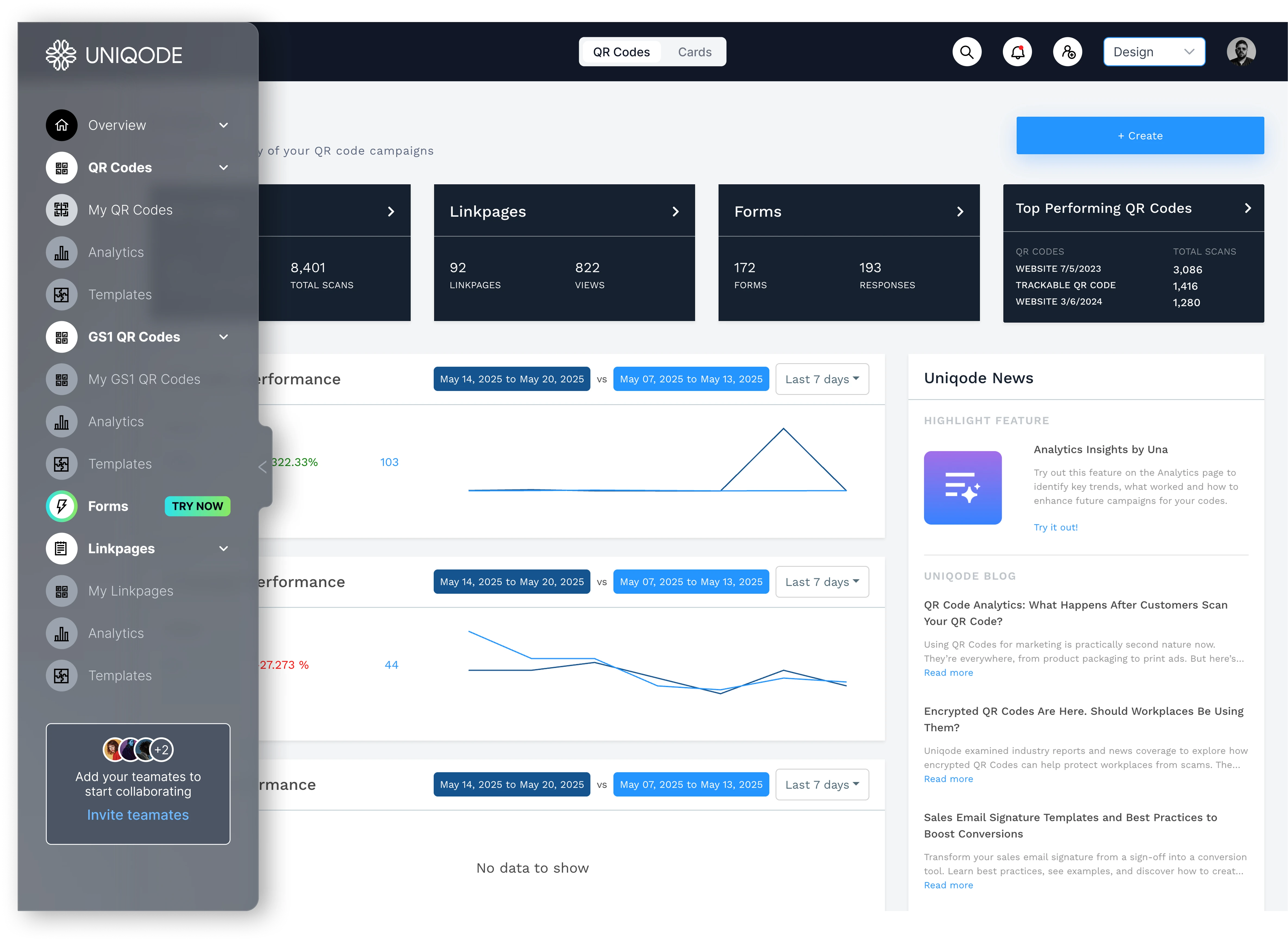
Left nav: glassmorphic exploration
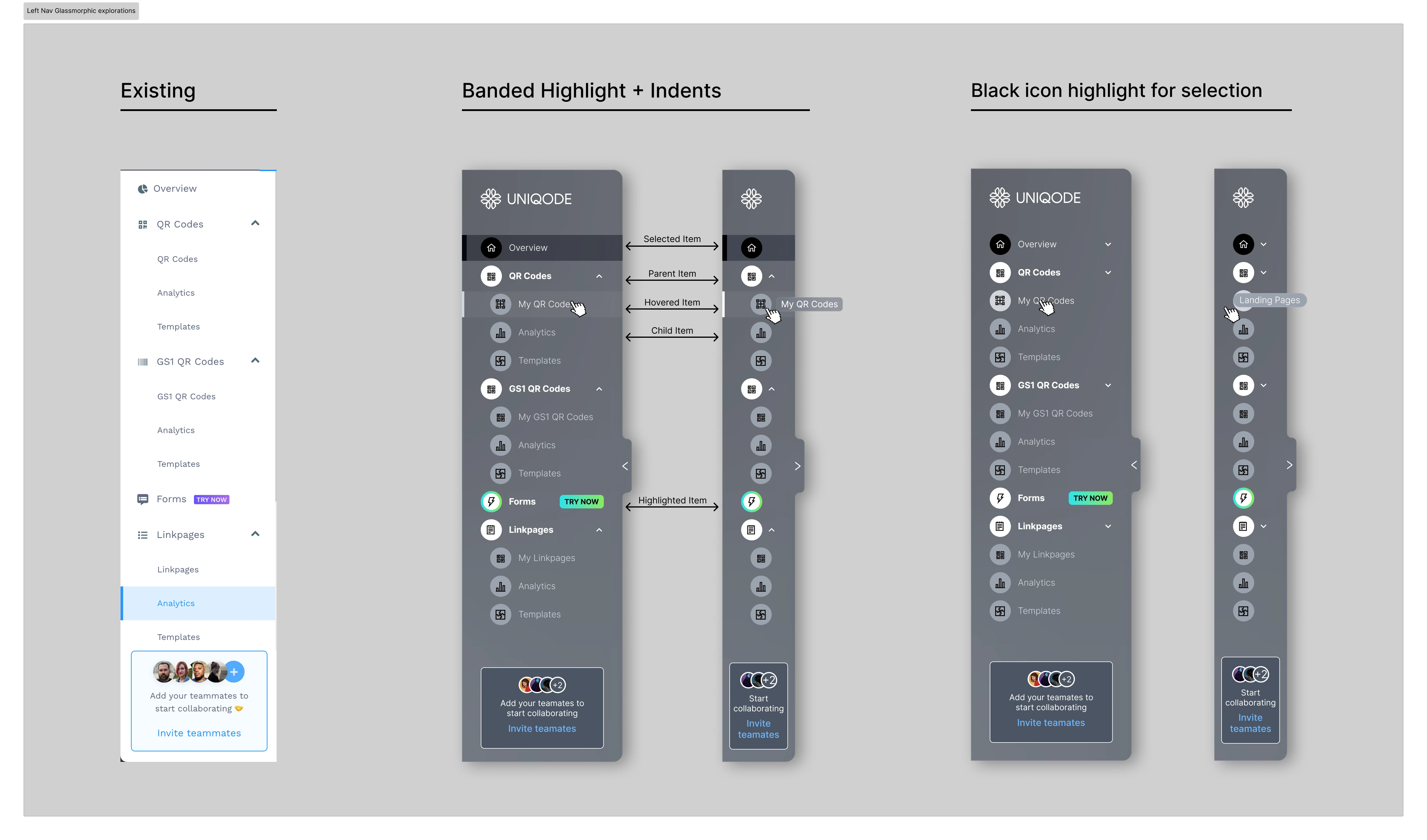
Exploration: glassmorphic left nav mocked onto the dashboard
A junior designer's independent take, reviewed alongside this one and passed over. It didn't land aesthetically.
Rejected in brainstorming
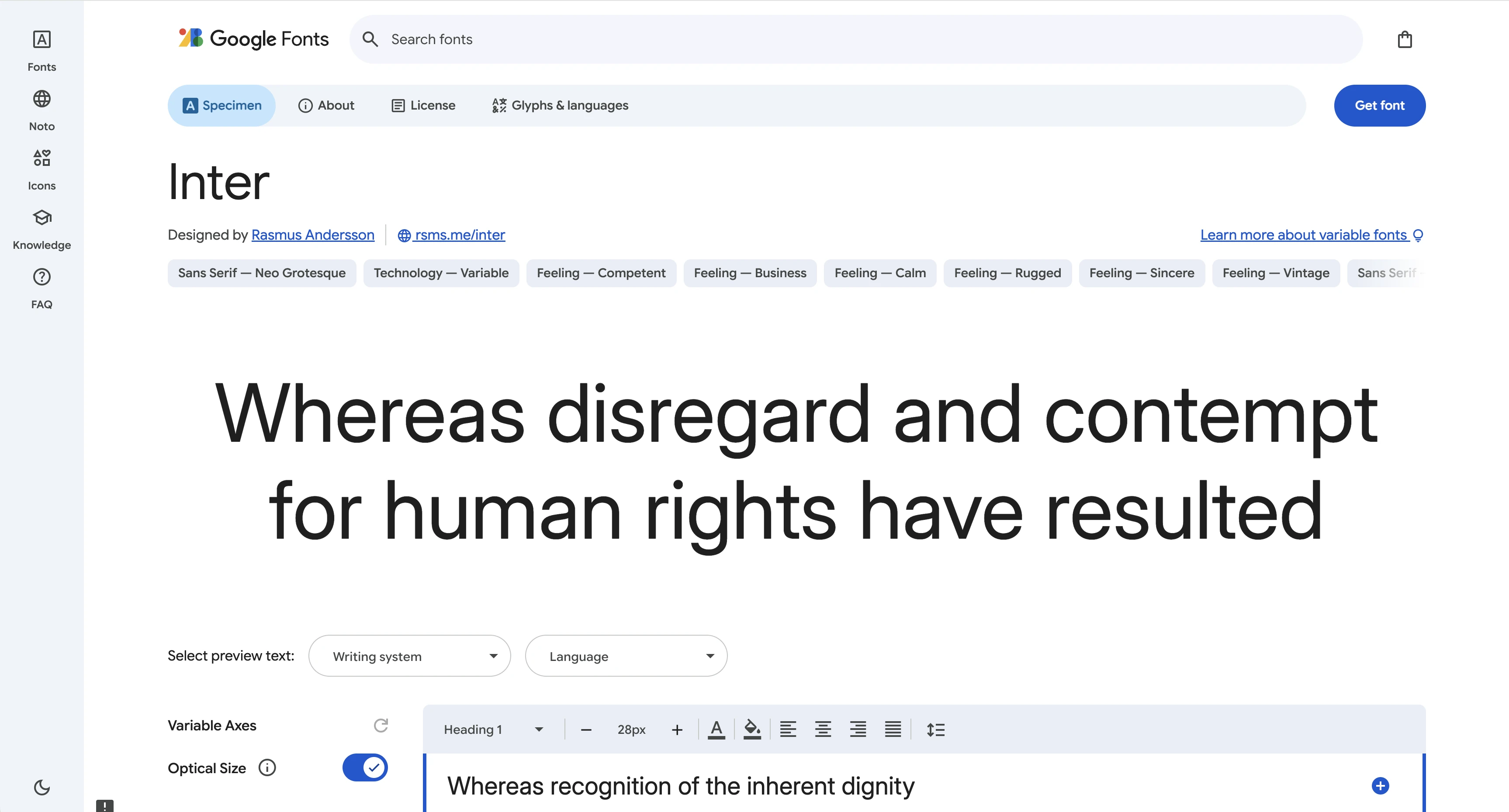
Type wasn't even consistent before this: some screens ran a generic system font, others still used Work Sans, the old branding's typeface, left over from before the rebrand. Inter is the new brand's typeface, so switching to it wasn't just a screen-friendliness fix, it also brought the dashboard's type in line with the rest of the rebranded product for the first time.
Inter, the font itself
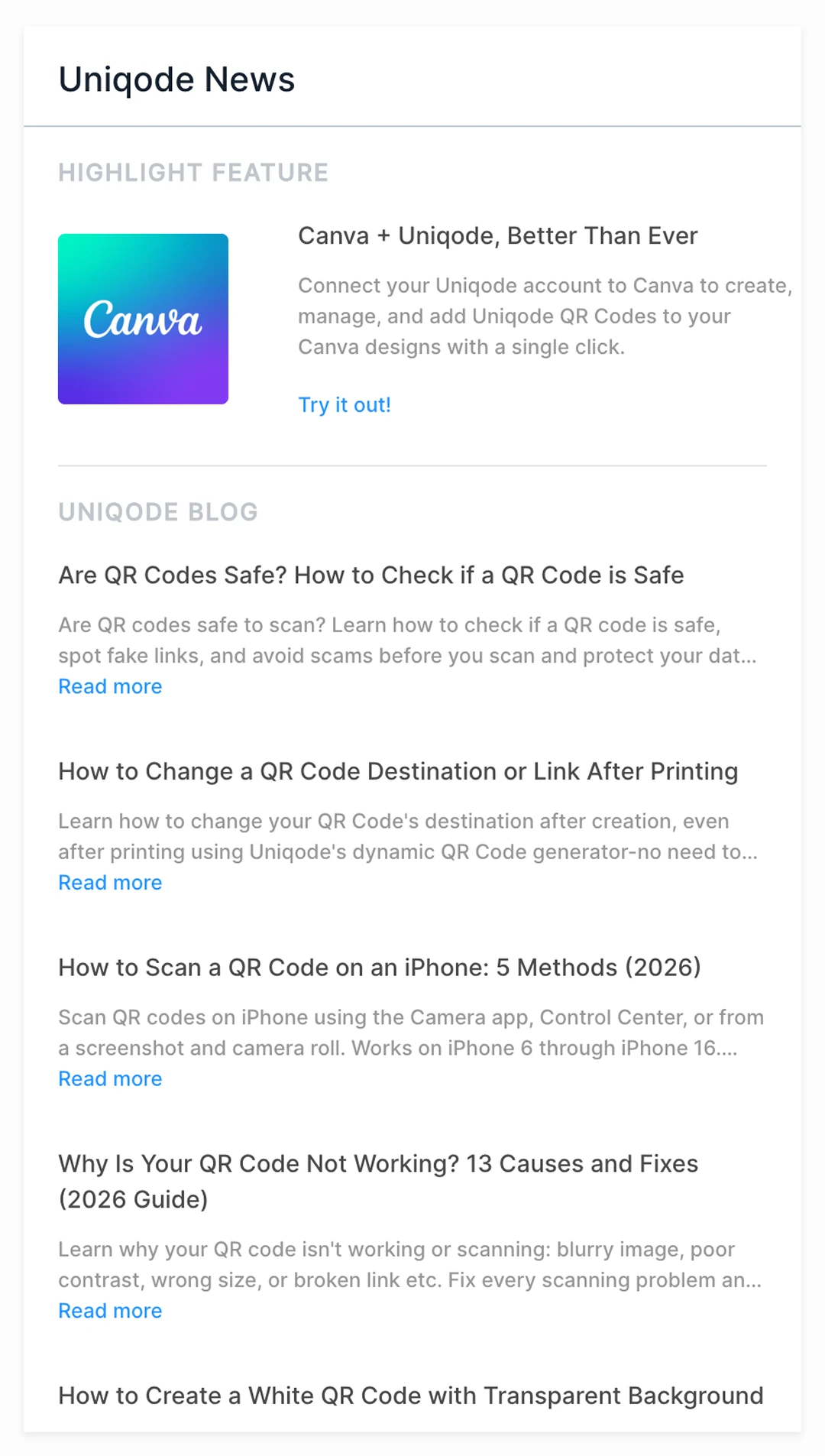
Blog content and a Canva promo don't belong on a page meant for checking QR performance. Removed; the space is now the Activity table below.
The panel that got removed
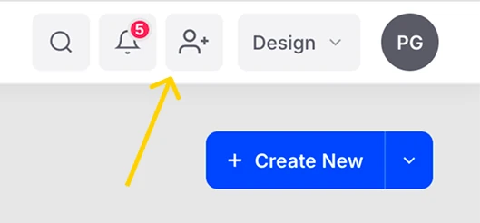
Useful once, then permanent sidebar clutter pushing real navigation below the fold. Folded into onboarding, with a small topbar icon for repeat use.

Before: the promo box
After: a topbar icon
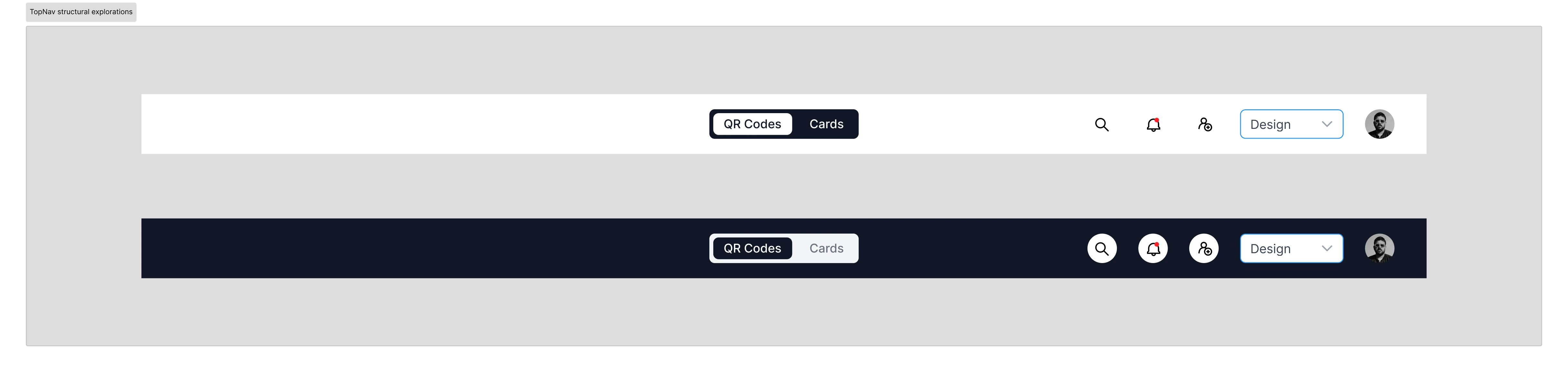
The toggle's underline used to float below the nav bar. Now a solid, centered pill. The date picker is gone (the chart has its own), and the search bar is now a single icon.
Before

Earlier exploration
After

Total Scans, Analytics, Activity: quiet uppercase labels that orient the eye without competing with the cards below them.
Total Scans
Analytics
Activity
One tabbed card, All / QR Codes / Linkpages / Forms, replaces three separate performance tiles.
Before
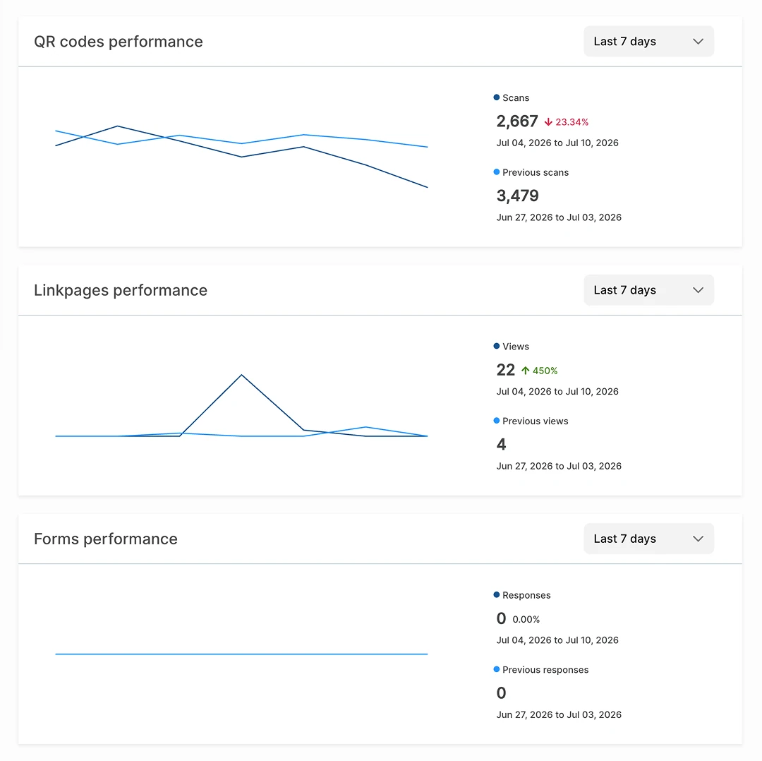
After
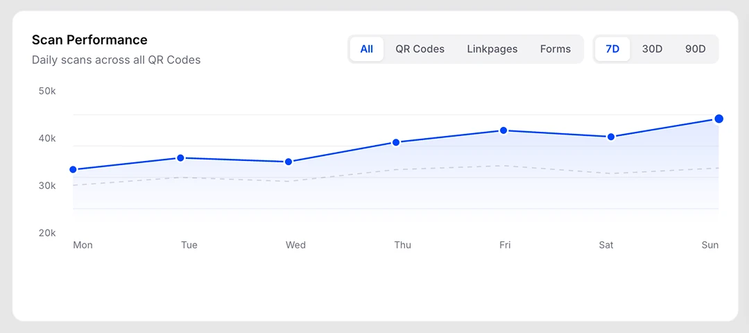
The full glassmorphic direction started here, as a Figma concept, before any of it was tested live:
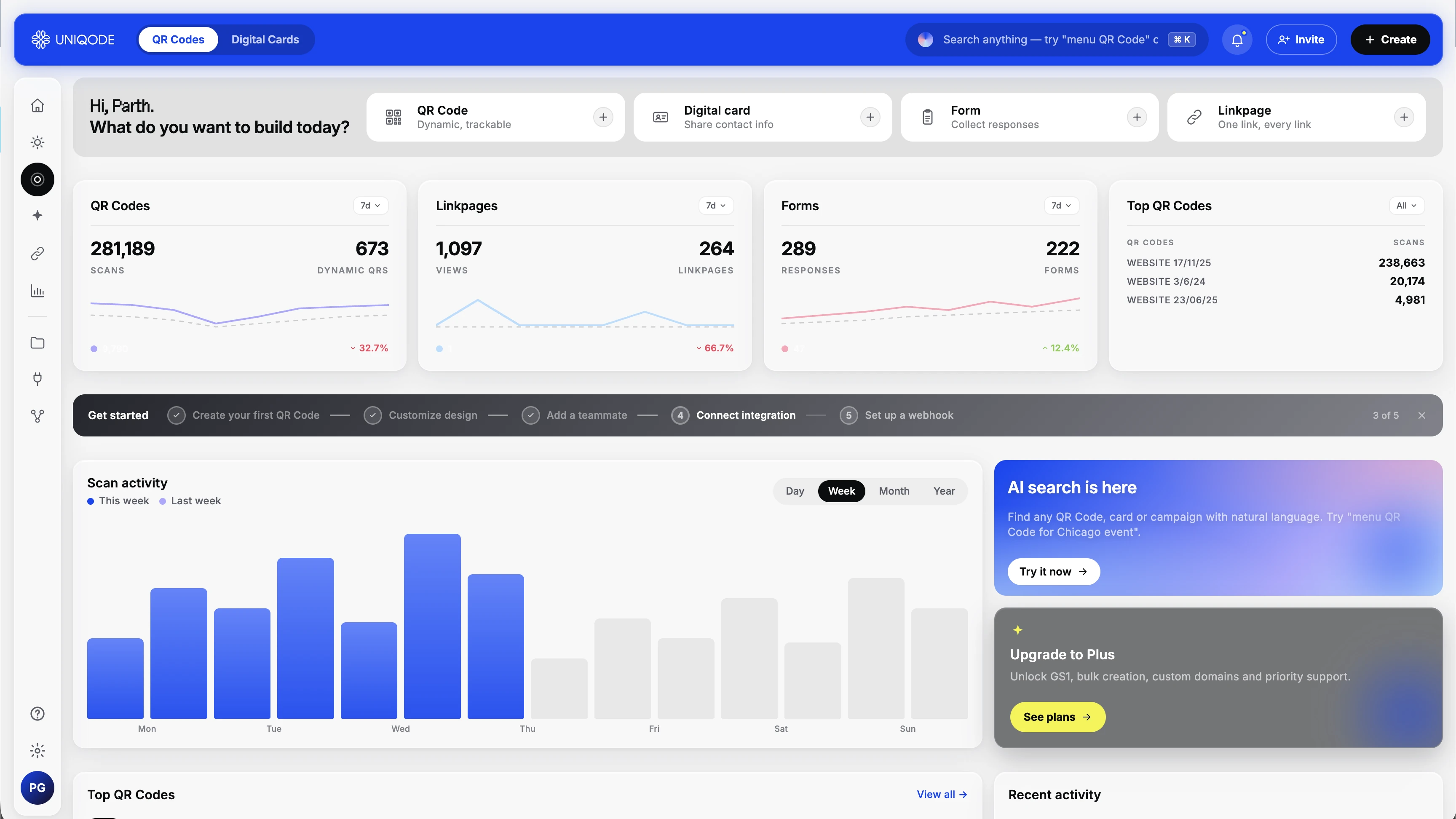
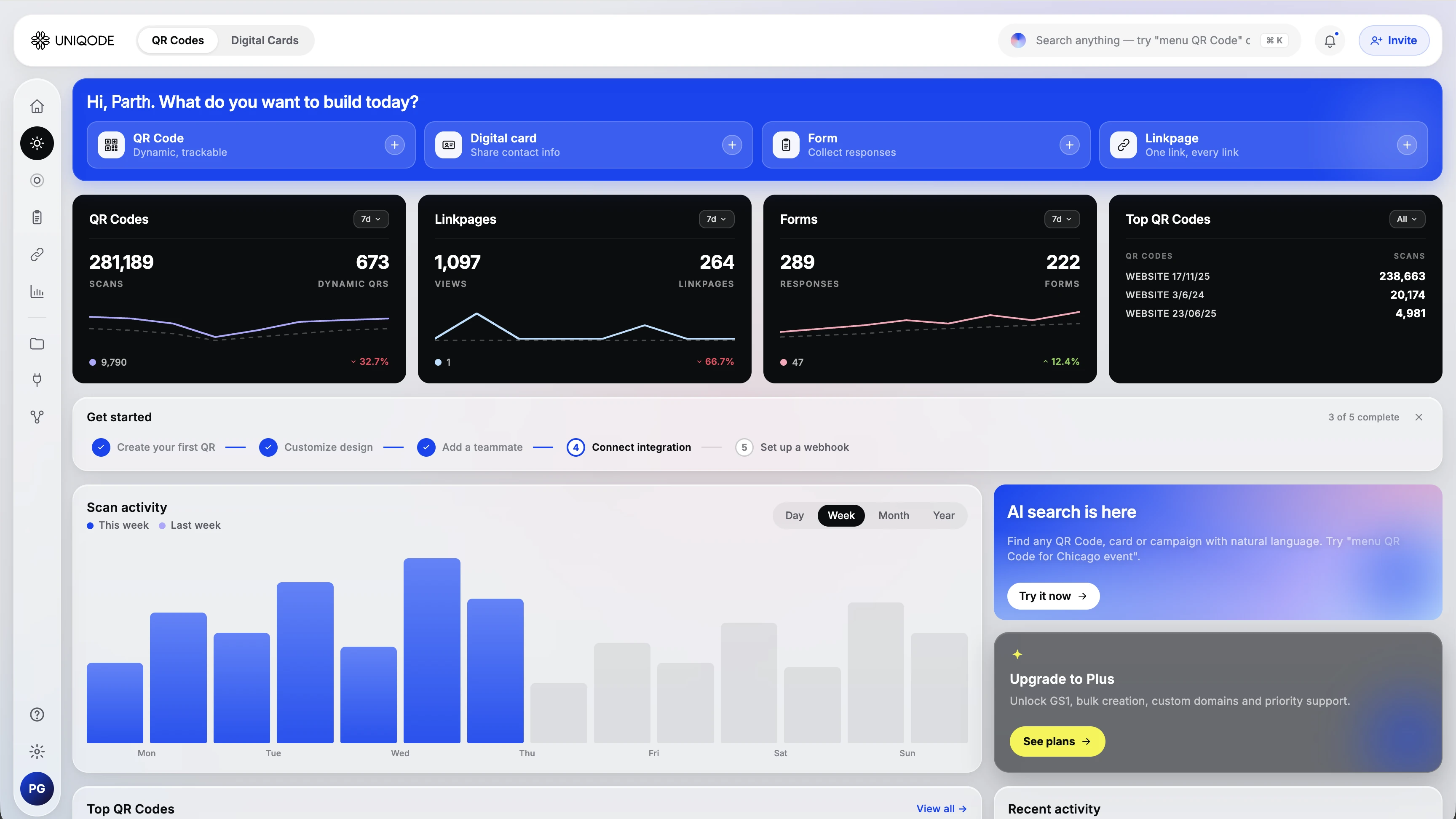
Glassmorphism is part of where the new brand identity is headed, so we didn't stop at Figma. We built three full versions and live-tested them with real customers. They didn't stick: too loud, too big a jump from what people knew, more marketing site than product dashboard. Our users today skew millennial, and that's who we designed for right now. But Gen Z's share of our user base will only grow, and this aesthetic plays well with them. So instead of discarding the work, we're keeping it as a future theme option:
Preliminary tests for Future design scope for genz users 1
Preliminary tests for Future design scope for genz users 2
Preliminary tests for Future design scope for genz users 3
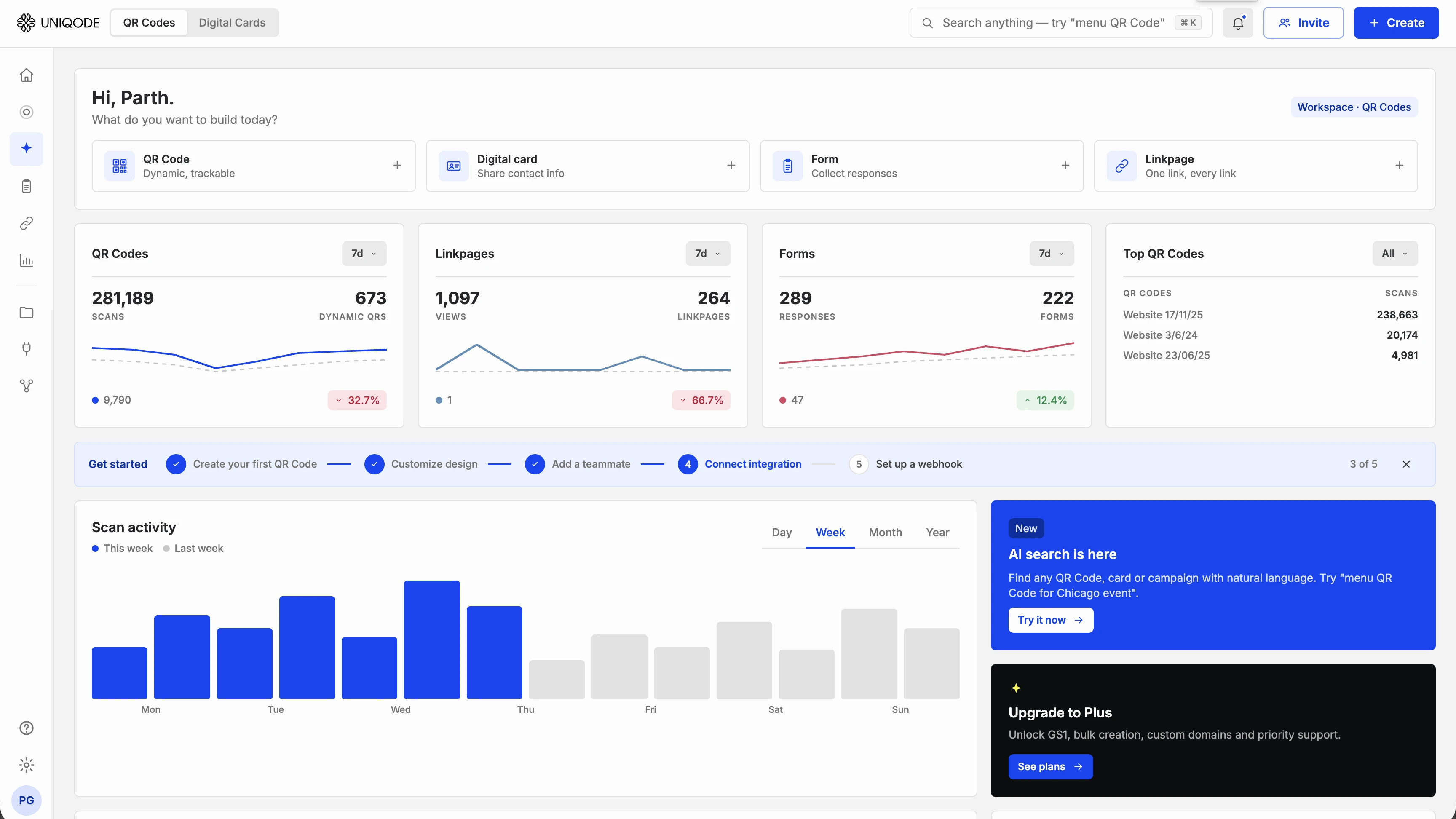
I prototyped directly in HTML and CSS using Claude Code, with the visual design done in Figma. A static mockup can't prove filters, hover states, or scroll behavior actually work. An HTML prototype runs in the same browser real users would use.
My design-to-ship workflow
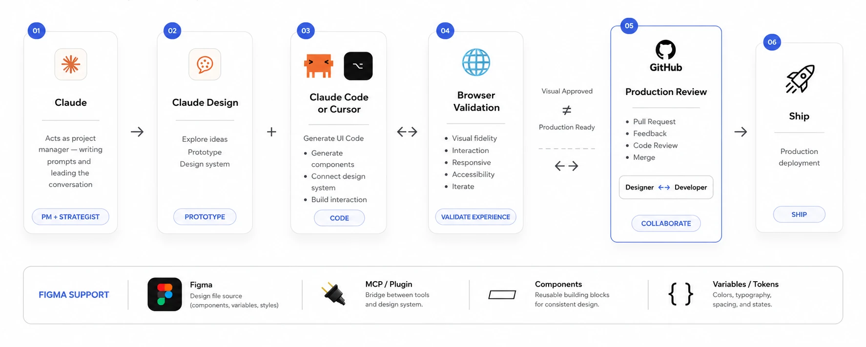
Every design decision was implemented, evaluated, and either committed or reverted before starting the next. No speculative batching.
Three features were built, evaluated, and fully removed: collapsible sidebar, KPI-level filter, and the verbose onboarding layout. Removing them was as deliberate as adding them.
The original design was preserved untouched in a backup folder. Every comparison was against the real original, not a memory of it.
Every batch of changes got reviewed with my manager, Aarti, before moving on, a second pair of eyes on whether something actually solved the problem, not just looked different.
Reviewing changes with Aarti
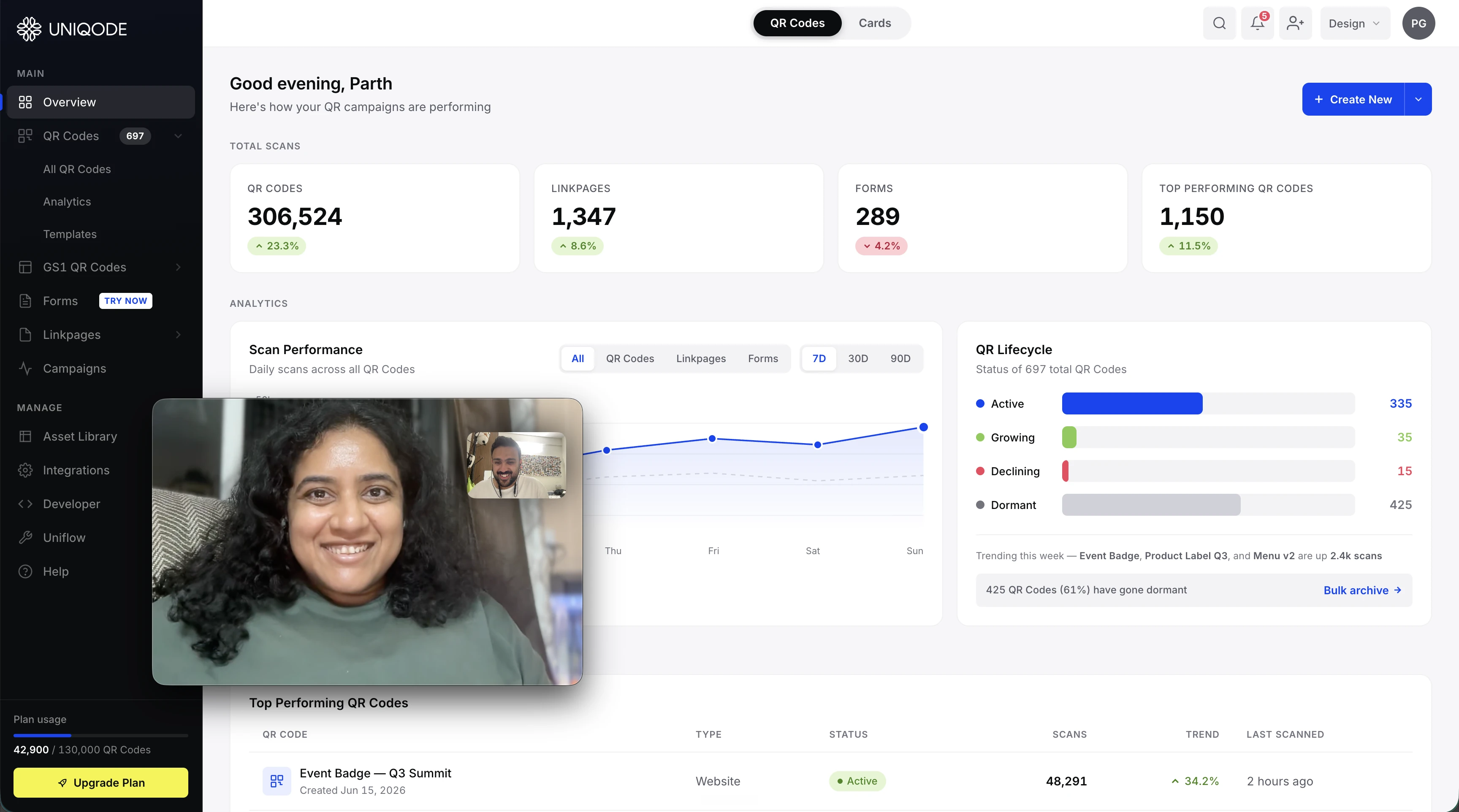
The final redesigned dashboard
| Metric | Result |
|---|---|
| Redundant data tiles consolidated | 3 → 1 |
| Screens cut from the Create flow | 1, 10% faster average creation time |
| Sidebar scrolling required | 0, and support complaints about not finding nav features fell 67% |
| Customers who clicked the in-context Upgrade button | 24% upgraded their plan |
| Customers who clicked "Update payment method" | 80%, sharply reducing expired-card dropout |
| Get Started pilot: features explored | 70% more users explored all four |
| Get Started pilot: retention lift | +33% vs. the control group |
| Top Performing QR Codes table interaction | 54% of users shown it |
| Bulk archive adoption since pilot | 21% |
| Lifecycle bar color count | 5 → 4 |
| Upgrade CTA logic | Adapts automatically to plan and payment status |
| Accessibility standard | WCAG 2.1 AA baseline, contrast and keyboard audited |
Mapping every element and asking "is this unique?" revealed the QR Lifecycle Strip was 66% redundant. That's not a call I would have made by feel alone.
Moving the Lifecycle status from a loud bar at the top to a calm card on the right didn't change the data inside it. It changed how loud the page feels on arrival.
Adding the onboarding stepper took an hour. Deciding to remove the QR Lifecycle Strip took a full audit and three rounds of comparison. Subtraction requires more confidence than addition.
A Figma mockup of glassmorphism shows the effect. An HTML prototype shows whether it actually works: during scroll, over different backgrounds, behind real content. Those are different questions.
The collapsible sidebar looked good on its own. In context, it made the whole dashboard feel cramped. I only caught that because I evaluated it alone, not bundled with three other changes.
The sidebar navigation and KPI tile content were already fine. I spent zero time reworking them. "Redesign everything while I'm here" is the enemy of finishing. Save the effort for what's actually broken, a cluttered sidebar, an extra screen in the Create flow.