



Qore: Building an AI-Native Design System From Scratch
I turned 150+ mismatched web pages into one design system built for AI, with no guide to follow. It took six weeks, and pages now ship in hours instead of days.
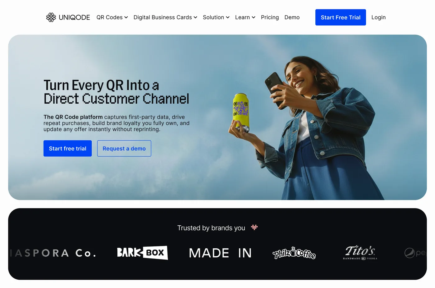
Before: CPG Page
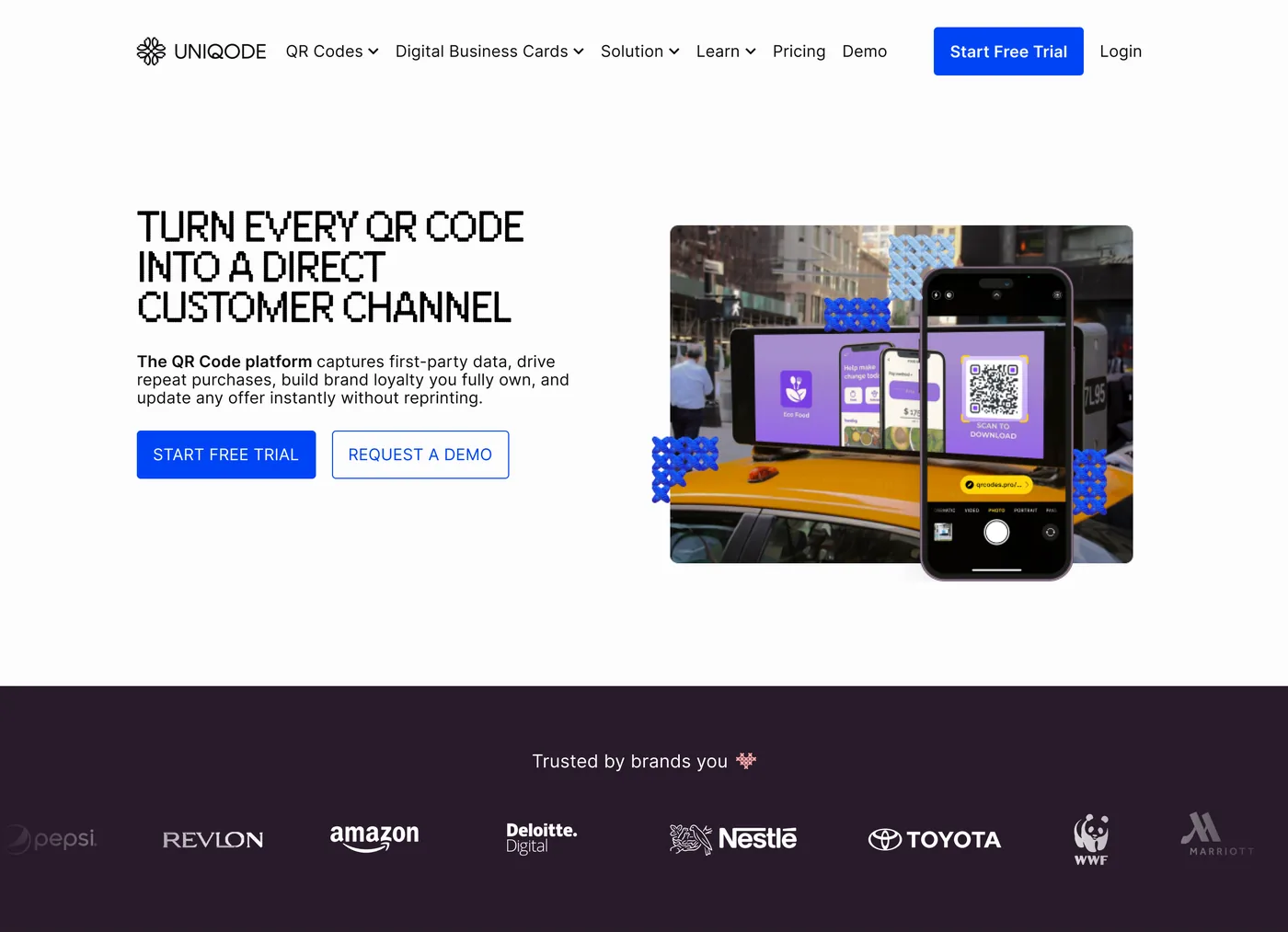
After: CPG Page
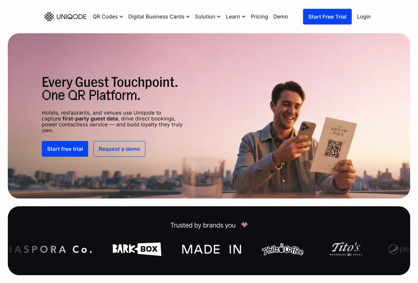
Before: Hospitality page
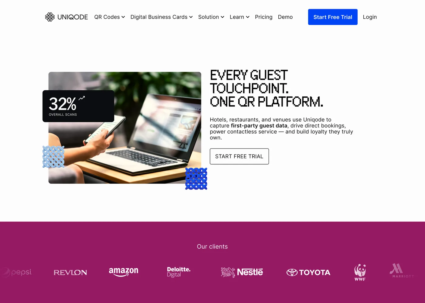
After: Hospitality page
Where this stands today. The design system is finished in Figma and the outside vendor is gone. What's left is the migration: moving the live marketing site onto this system and retiring Webflow, which is underway now.
The problem
Our marketing site had no real design system, so 150+ pages were inconsistent, slow to ship, and unreadable by AI.
See the screenshots: four templates, one huge tracker
Four templates, one system missing

150+ pages, tracked by hand
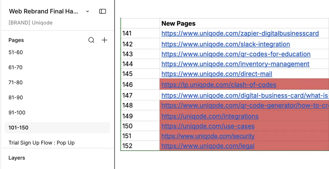
Designed (Figma)
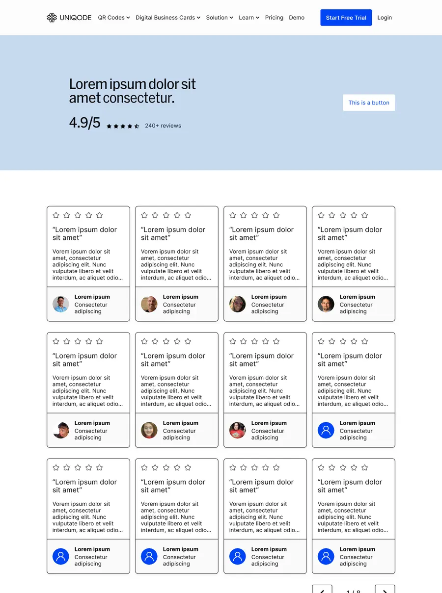
Shipped (old live site)
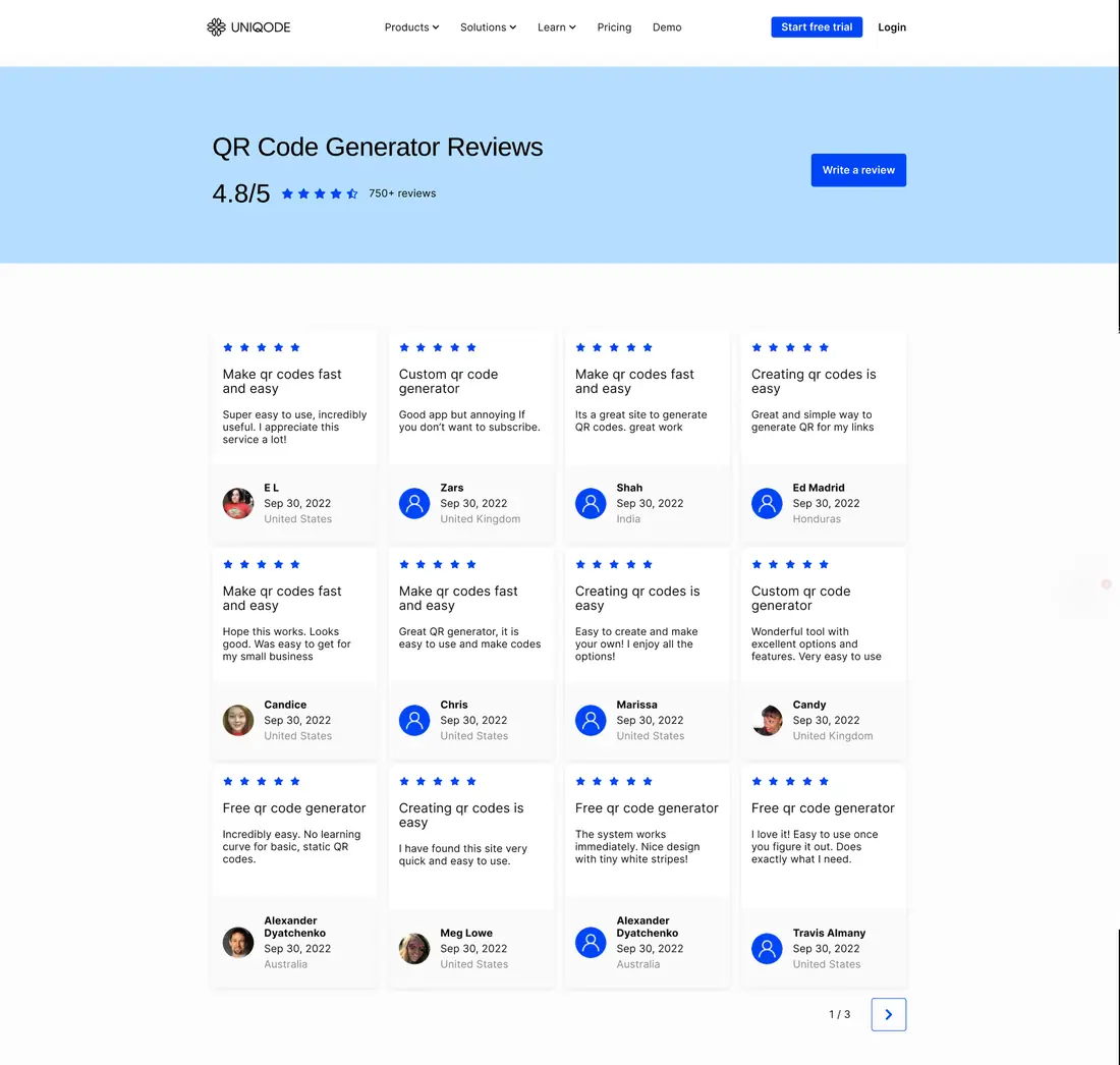
The old way of building pages made it worse: every page was custom, built from scratch. That meant a fresh round of feedback on every single page, instead of once per reusable piece.
Design review, at scale
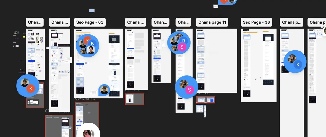
Three fires made it urgent, all at once:
What we designed wasn't what shipped
An outside vendor rebuilt every Figma page in Webflow by hand. Spacing and states drifted each time, so the live site stopped matching its own designs.
The vendor was expensive and slipping
The vendor was a big name with a big price tag, yet ran one to two weeks late on almost every page, so our whole roadmap slipped right along with them.
Our search rankings were under threat
Search and AI crawlers kept changing how they read sites. Our blog had moved to Sanity to keep up, but the slow marketing site simply could not follow.
One fix could solve all three:
The fix
Migrate off Webflow onto Sanity, powered by a design system precise enough for AI to read pages and rebuild them automatically, with no vendor in between.
Why Sanity
Engineering had already tested it, moving our blog off WordPress. Cheaper, AI-friendly, and easy for non-technical people to update. SEO improved too.
Where it stands
That design system didn't exist, so I built it. The vendor is gone, validated end to end, and a page now ships in 1 day instead of 4, no new hires needed.
Why this was actually hard
No guide exists for turning a messy website into a solid design system using AI tools like Claude Code and Figma. No case study. No blog post. Nothing.
No starting point
Every design system guide assumes you're starting from nothing. I wasn't. I had 150 pages of one-off decisions, none written down. I had to write the guide while building the thing itself.
No precedent to copy
I was also working with brand-new tools. Figma's AI features were barely out. Nobody had built a design system this way before, so there was nothing to copy. Every choice below was a first try, not a proven method.
On top of that, five more challenges piled up
Zero downtime allowed
The vendor causing the problem was also the only team shipping pages.
Running on a cheaper model
Most of the build ran on a lower-cost AI model, which meant more mistakes for me to catch by hand.
Mentoring while building
I was teaching a junior designer how to use AI tools while building the design system itself.
300+ cards to untangle
One piece alone took enormous time: 300+ card designs across 150+ pages, narrowed to 38, then down to 4. It took this long because the cards had almost nothing in common. Each one had to be rethought, not just renamed.
Claude couldn't read Token Studio
Most design systems store colors and sizes in a separate file that a plugin like Token Studio manages. Claude couldn't read that format, so every change meant exporting a file, editing it by hand, and re-importing it. I wanted to skip that entirely.
How I actually built it
I borrowed patterns from shadcn/ui and Uniqode's own product system. But the product system was too packed for a marketing site. Both were starting points, not templates.
Too minimal: shadcn/ui
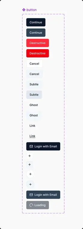
Too much: PrimeNG
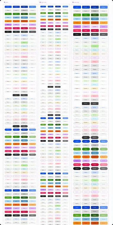
The middle ground: Qore
Step 1 → I checked what we had before building anything
I didn't start from zero. I started from what already worked.
I picked the 20 best-performing pages out of 150 and broke down their pieces to use as a starting kit. Then I had Claude check it: "compare this starting kit against all 150 pages, tell me what's missing."
Build on what's proven. Then fill the gaps.
The check-up results
Step 2 → Get the basics right first. Always.
No jumping straight to the fun stuff. I locked down the boring layer first, because everything else depends on it:
Skip this order and you end up rebuilding everything twice.
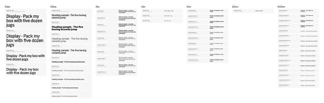
Text sizes
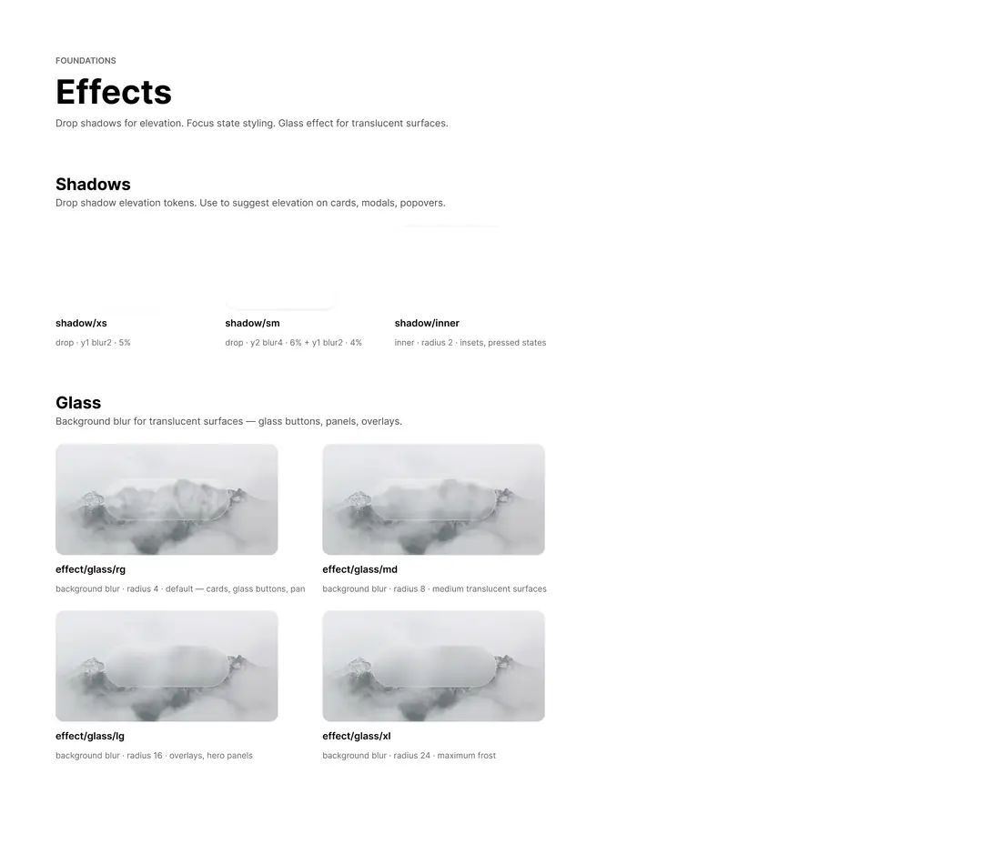
Shadow & glass effects
The specific choices, and why
"Basics first" isn't just an ordering rule. Every number in that layer was its own small decision:
Body text: 16px
The size browsers already use. Smaller is hard to read, bigger looks clunky.
Text scale: 12px to 72px
Eight clear sizes, from small labels to big display text, so no size is ever a guess.
Tight headlines, roomy body text
Headings stay compact. Body text gets extra room, because that's where people read.
Corner radius: 0 to fully round
Small controls 2–4px, buttons 8px, cards 12–16px, big surfaces 24–32px.
Buttons: 8px, with a pill built in
A fully rounded pill option, ready now for a look we'll use soon, not yet today.
Every gap is a multiple of 8
One simple rule, so sizes always line up and scale cleanly across every screen.
None of this was rule-following for its own sake. It's the same bet as the color and button work: fewer, well-chosen options, so a human and an AI make the same call every time.
Step 3 → I picked Figma's built-in variables over Token Studio's token values
Our product team used Token Studio, a popular Figma plugin. I tried it for Qore too, but with Claude in the loop, it fell apart. Every change meant exporting JSON, importing into Claude, editing, then uploading back into Figma by hand.
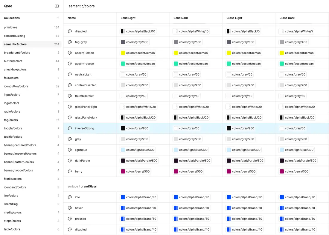
Why we used Figma's native variables and styles instead:
- Figma's built-in variables and styles need no export/import round trip. Figma reads them natively.
- Claude could read and edit them directly through Figma's MCP connection. It couldn't touch Token Studio's file at all.
This saved real time. Every piece still got all four looks (Light, Dark, Glass Light, Glass Dark) and written notes. Everything still needed rounds of checking, since Claude would sometimes edit the wrong piece. Newer AI models got noticeably better at this as the project went on.
Colors, linked to modes
It wasn't just cards: everything got simplified
A few other cleanups happened alongside the card work:
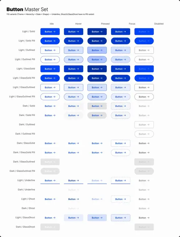
Buttons
2 styles → 4 (Solid, Outlined, Underline, Ghost), × 2 shapes (square, pill), × 5 states each (idle, hover, pressed, focused, disabled): 40 button variants in total, replacing 2 hand-built ones.
Looks
The old design system only had a light look. Qore adds dark, frosted-glass light, and frosted-glass dark, so the brand stays correct everywhere and it's ready for what's next.
Images
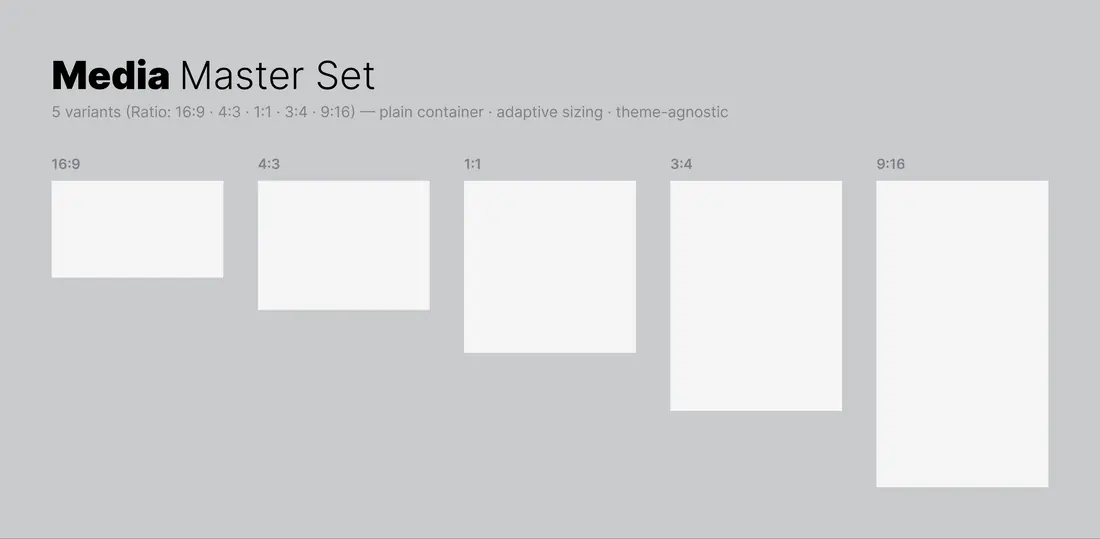
Cut down from endless, inconsistent image sizes to 5 fixed aspect ratios, so AI-made images stay consistent.
Text
Defined a full set of text sizes: big headline, medium headline, body copy, fine print, and more.
Icons
Built around the Atlas icon set, backed up by Unicon, a Claude-based icon generator, for the rare case where nothing in Atlas fits.
Spacing
The 8px scale set in the foundations carried straight through cards, buttons, and every other piece, so nothing needed its own one-off spacing values.
Image aspect ratios, standardized
Step 4 → The card problem: my biggest call on this project
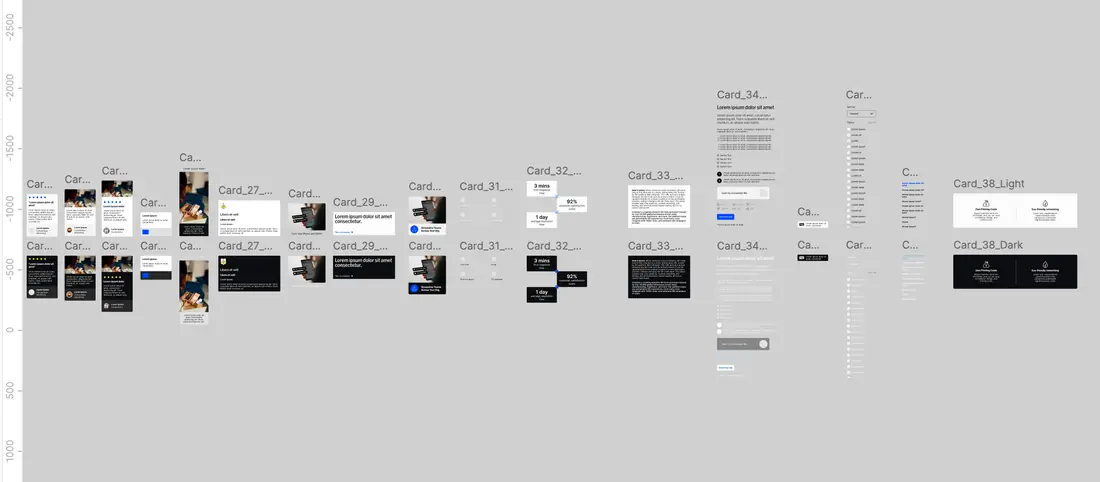
There were no reusable components across our original 150+ pages, so every page had built its own one-off card, with nothing connecting any of them: 300+ card designs in total. I surveyed and audited all of them, with Claude and a fair amount of manual intervention, down to 38 variants across two themes, light and dark.
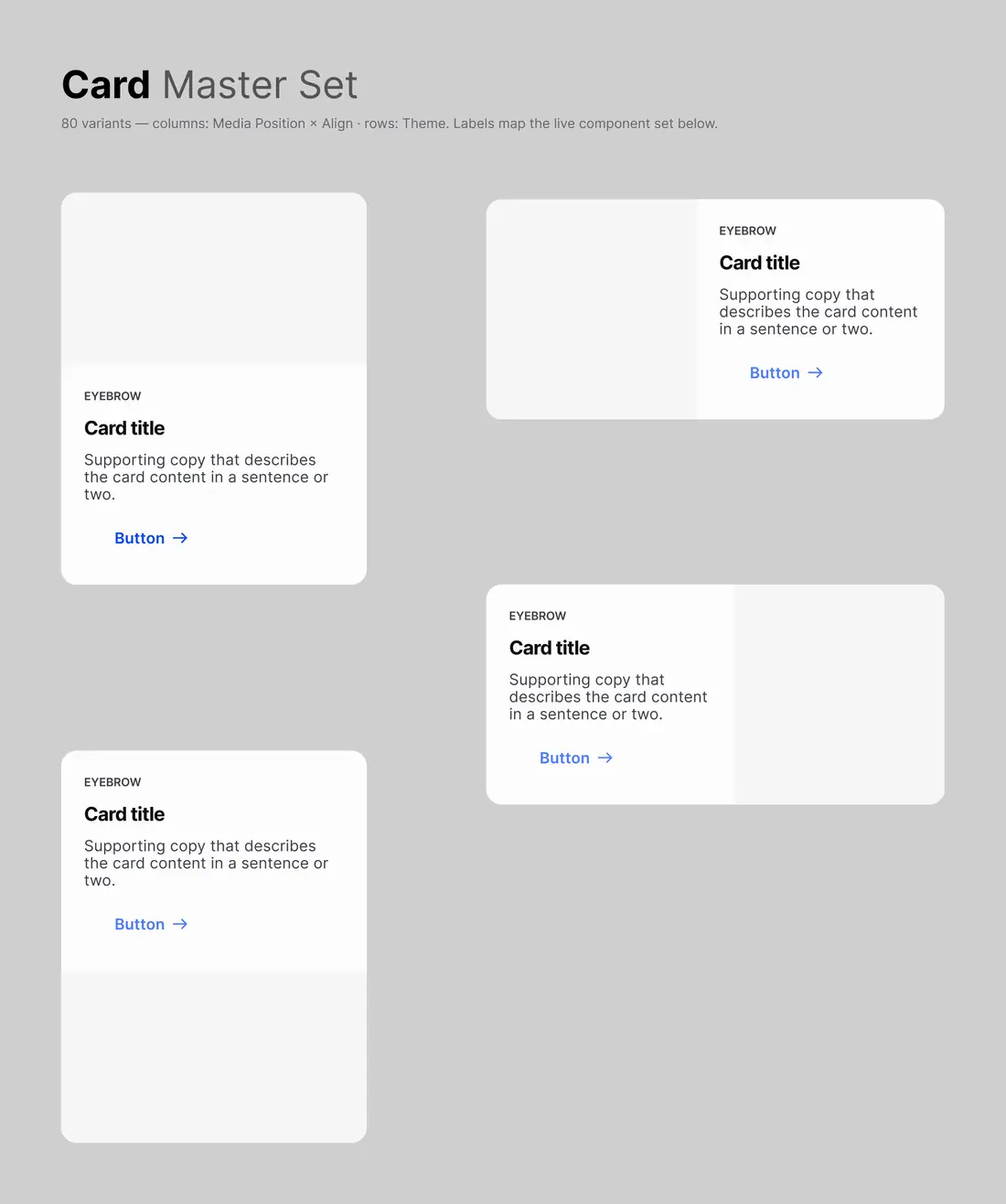
I could have kept at least 100 of them around. I didn't. I narrowed everything down further, to 4 core layouts.
Most of the original 300+ fit perfectly into the new design system. For the few that didn't, I redesigned them to fit, instead of treating them as permanent one-offs.
Fewer options. Less room for error. Easier for AI to copy with one clear design system. That was the entire point.
The four that survived
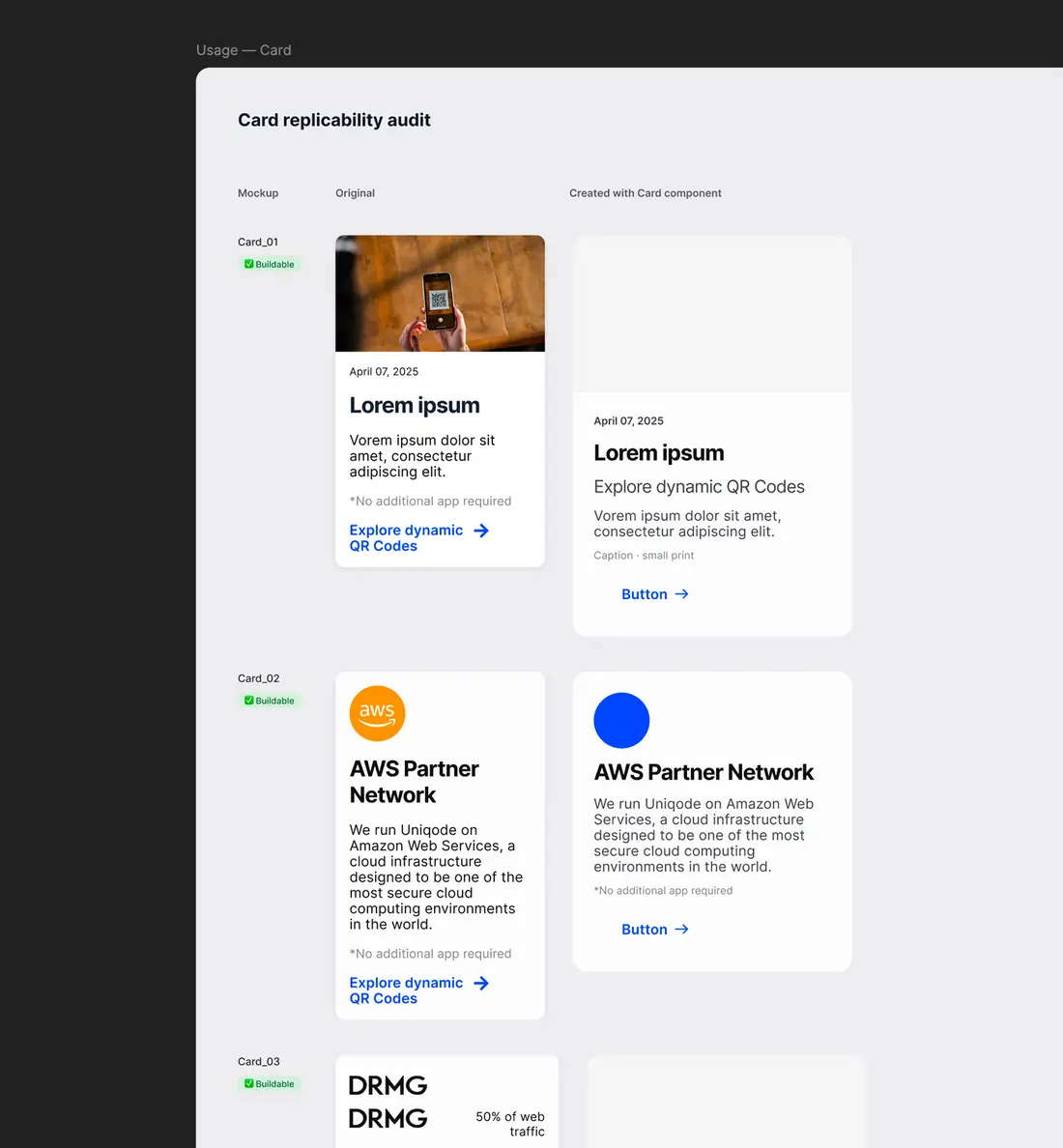
Side-by-side proof
Step 5 → I built for where we were going, not where we were
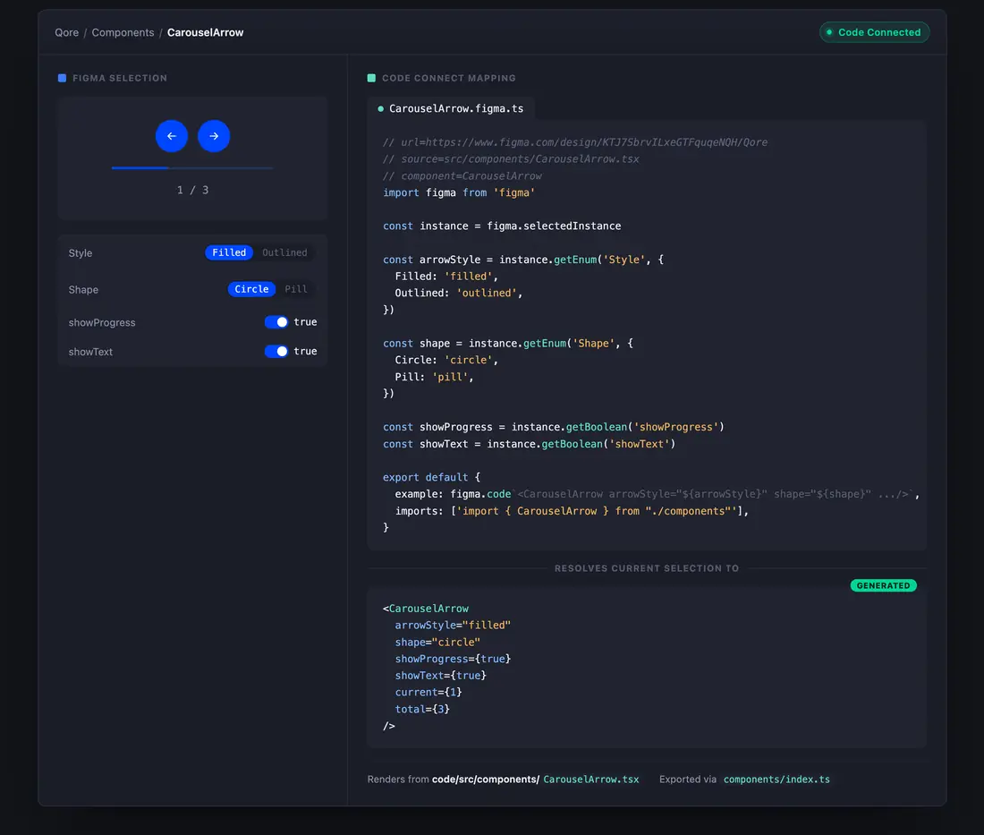
Every decision targeted Sanity as the end goal, not Webflow as where we stood. The real target: a design system clean enough for Figma's code-linking tool to turn straight into working code, with no translation errors and no vendor in between.
Figma, linked to code
Step 6 → I matched the AI model to the job
I didn't use one AI model for everything. Cheap models did routine work; the best models did anything expensive to get wrong.
| Task | Model | Why |
|---|---|---|
| Routine, everyday work | Sonnet 4.6 | Keeps cost down across a month-long build |
| Harder, higher-stakes work | Opus 4.7 | Buttons, full design-system checks, anything expensive to get wrong |
| The hardest piece in the design system | Claude Fable 5 | Built the entire card design in a 2-day early-access window |
Step 7 → I found the biggest gap in Figma and AI working together
Early on, Claude couldn't reliably see how a Figma file was built. My workaround was describing each design by hand. It worked for one or two pieces but broke down past three.
The fix: Figma's own skills. Claude Code could read every page, frame, and variable inside a Figma file on its own. Sharing a link to one node was enough context for a direct edit.
Prompting was the second problem. Figma comments couldn't target one specific part of a component, so I re-described every change manually. Figma annotations solved that: Claude Code reads them directly and resolves them once the fix lands.
The fix that closed the gap
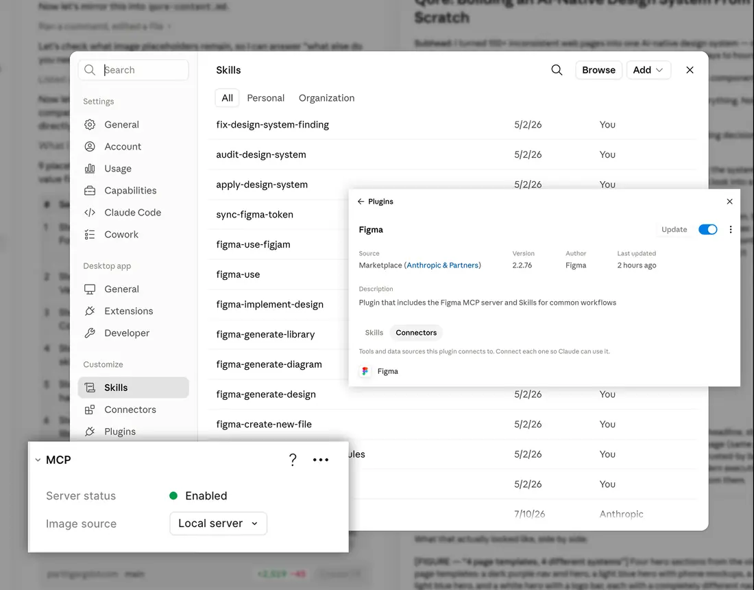
Without it, an estimated 80% of this project doesn't happen at this speed.
Step 8 → I built a memory system so nothing got lost
AI forgets. Claude's context window is finite. Once it fills, the next session starts from zero, re-explaining the project re-introduces the same mistakes I'd already fixed.
The fix: a running notes file (handover.md) that Claude updated itself before each session ended. What changed, what worked, what didn't, what's next. The next session read it and picked up exactly where the last one stopped.
The running notes file
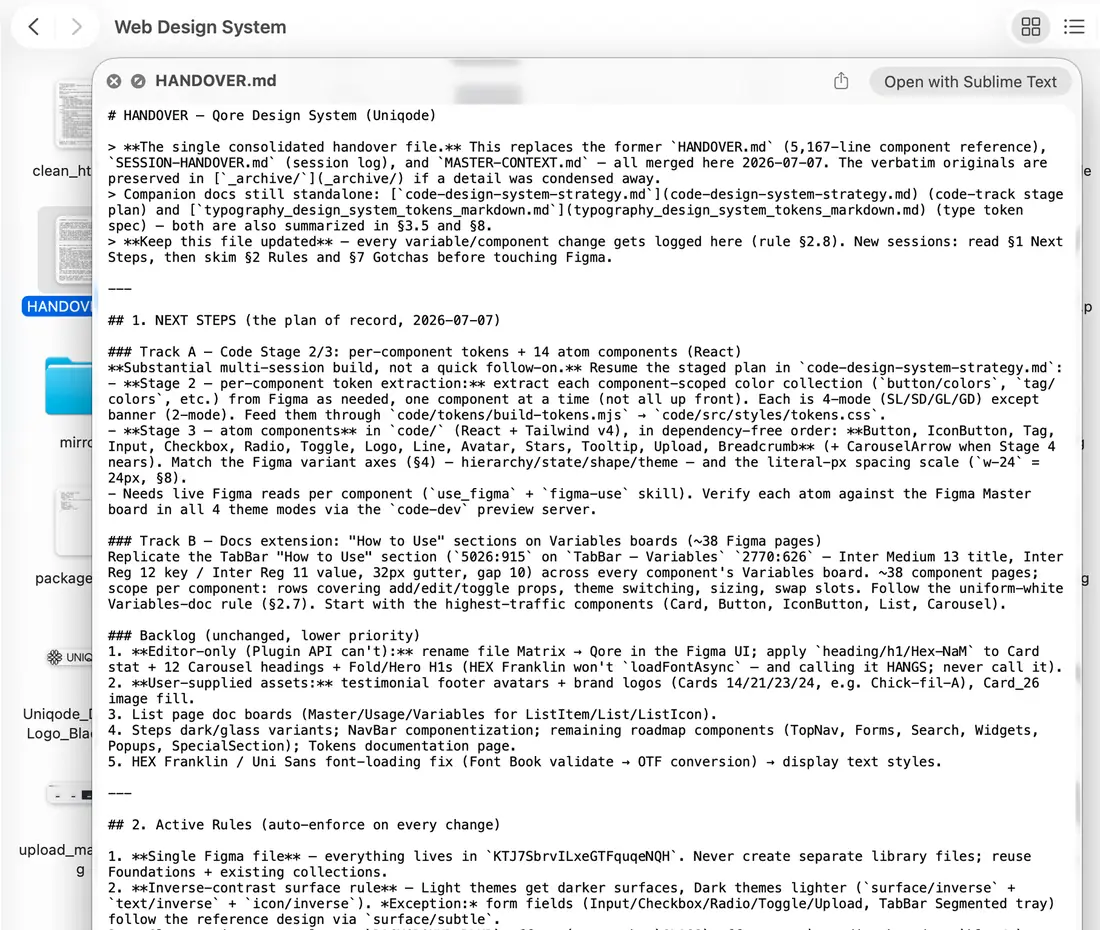
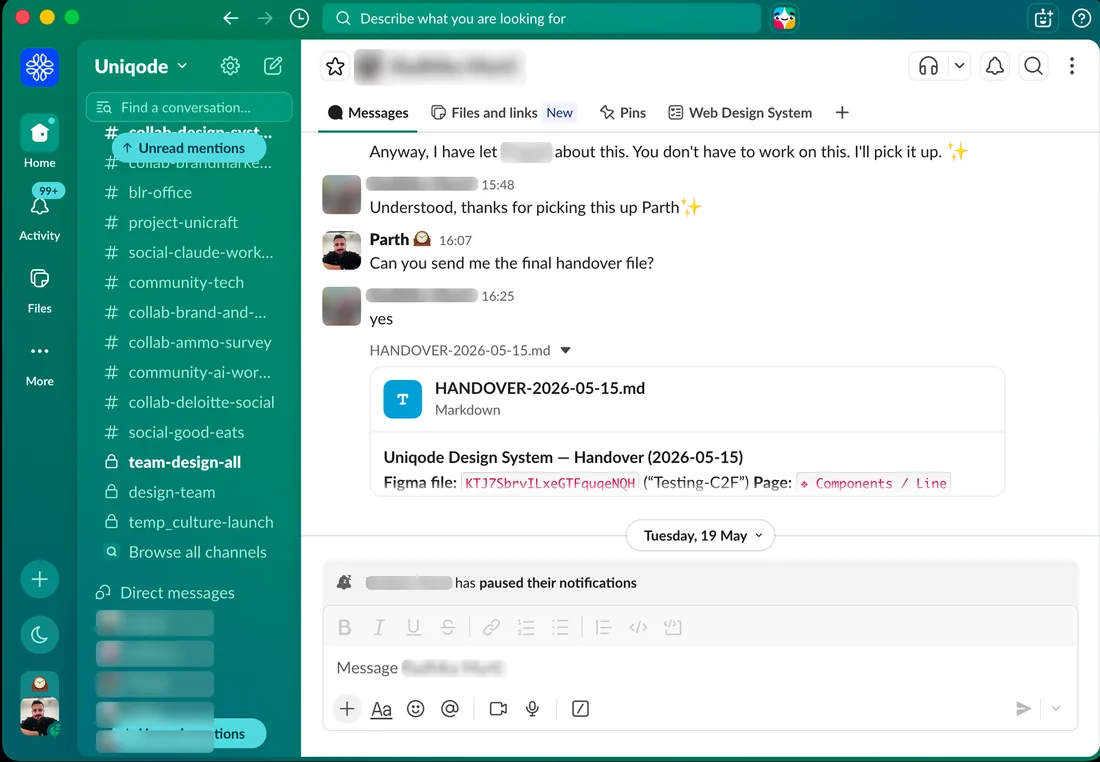
It also let the junior designer and me work from the same base. We shared and merged our handover.md files, so neither of us had to re-explain anything. The AI already knew how things worked.
Shared context, in Slack
The task split
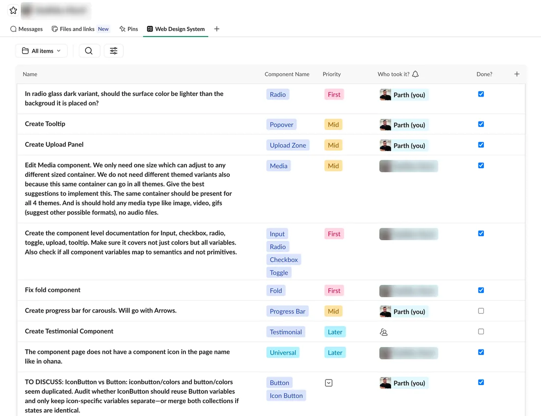
One unexpected benefit: Claude could read the notes file and write a day-by-day project update on demand. Free status updates, with no hit to actual work time.
This later split into two layers: one master file with the full project history, and small per-session files for whatever was active that day.
Nothing lost. No re-explaining. Every single time.
Step 9 → I checked every single card, not just the new design system
Building the design system was half the job. Auditing it was the other half.
I checked every card against its original, one at a time, and marked each as matched, redesigned, or a noted exception where the new design system genuinely couldn't copy something unique.
This caught things a lighter check never would have:
- A hidden bug in the Ghost button (uneven spacing on 10 versions) that I traced back to its real cause instead of just patching it
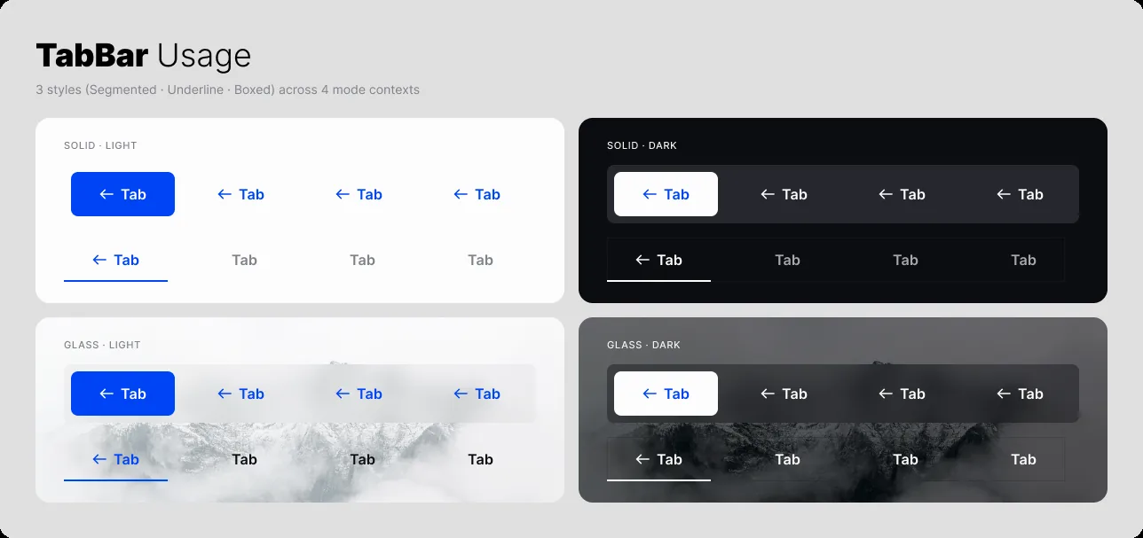
- A layout problem in the tab bar, caused by fixing that same bug, which I fixed without undoing the original fix
- A full icon check across 10+ pieces, deciding one by one what should resize and what should stay fixed
I fixed causes, not symptoms. That's the difference between a real design system and a pile of patches.
TabBar in use
Step 10 → I ran the same check across everything, not just cards
The card cleanup wasn't a one-off. I ran the same "how many designs does this actually need" check against all 34 pieces in the design system, not just the one that made headlines. AI helped with some of these.
The piece-by-piece results
| Piece | Old file | Qore |
|---|---|---|
| Card | 38 designs | 4 core layouts |
| Accordion | 7 | 2 |
| LogoBar | 4 | 2 |
| FlipTiles | 3 | 2 |
| IconBand | 3 | 2 |
| Fold | 6 fixed layouts | 1 flexible system |
Some pieces didn't need any changes at all. BadgeBar, BragBar, SocialProof, Carousel, InlineBanner, and Banner matched the old file's count exactly. Where the old design system already had it right, I left it alone instead of changing things just to touch everything.
6 pieces cut by half or more. 6 left exactly as they were. 6 are brand new (IconButton, Line, Stars, Avatar, List, Fold/Hero), doing things the old design system never could.
Step 11 → I connected the system to code, permanently
The design system doesn't just live in Figma. Using Claude's Code Connect skill, every piece maps straight to its coded .tsx component. Claude reads actual production code, not screenshots.
That pays off the moment a new page starts. I hand Claude a wireframe, it reads the design system directly and builds a working, on-brand page from the first draft. No manual handoff.
Figma, the code, and Git stay in sync automatically. The whole pipeline, from wireframe to working page, runs on AI.
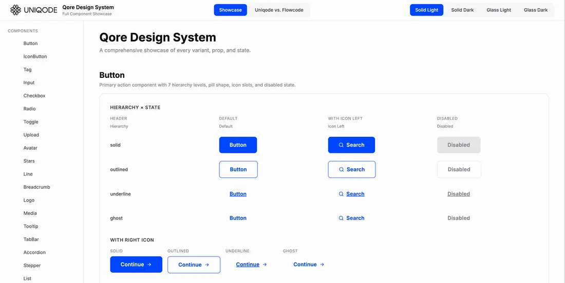
The finished system
The numbers
| Metric | Result |
|---|---|
| Build time | 1 month, vs. 3–6 months by hand |
| Card designs simplified | 300+ → 4 core layouts |
| Brand consistency achieved | 100% |
| Time to build a page | 4 days → 1 day |
| Design time per page | 5 days → 3 hours |
| Looks supported | Light only → Light, Dark, Glass Light, Glass Dark |
| Outside vendor | Fully removed |
| New hire avoided | 1 junior designer |
| Card cases still covered | 34 of 38 in-between cases, no changes needed |
| Pieces fully documented | Every one, in all 4 looks |
| Bugs fixed at the source, not patched | Button spacing bug |
| Work lost between AI sessions | Zero |
| Designers who can run this on their own | Multiple |
| Design-to-code handoff sped up | ~30% faster, ~10 min per page |
| Pieces checked system-wide | 34, one at a time |
| Brand-new pieces shipped | 6 (IconButton, Line, Stars, Avatar, List, Fold/Hero) |
| Image aspect ratios standardized | Unlimited/inconsistent → 5 fixed aspect ratios |
| Button style combinations | 2 → 8 (4 styles × 2 shapes) |
| Webflow subscription | Being canceled |
| Added AI cost | One upgraded Claude plan |
What I'd tell you if we grabbed coffee
This wasn't just a design cleanup. It was three things at once:
Claude made design, and the pipeline, easy
Claude did the heavy lifting on both ends: turning decisions into a real design system, then reading a wireframe straight into a working, on-brand page. Design and engineering no longer wait on each other by hand.
One system, everywhere, consistently
Every page now draws from the same 4 card layouts, one button set, one type scale. Nothing is a one-off anymore, so nothing can quietly drift from the brand.
SEO improves again, with Sanity
Moving off Webflow onto Sanity, the same platform already powering our blog, is what actually unblocks the SEO fix this project was partly built for.
Off the record, the honest parts:
The real work was checking, not directing
Telling the AI what to do was easy. Checking what it actually did was the job.
Speed cuts both ways
AI could build something in seconds, and just as quietly break something it built correctly yesterday. Every hour of speed needed an hour of checking.
"Finished" means someone else can run it
Training a junior designer through the same uncertainty I was living changed what "finished" meant to me. A system only I can run isn't actually finished.
Better tools would have helped less than you'd think
If I started today, I'd skip most of the manual troubleshooting from Step 7. But I'd still check everything by hand. That was never about missing tools. It was just the job.
Trust, once earned, was the real speed unlock
Approving every single step broke my focus, because Claude Code kept working correctly every time. Once I trusted that and stopped asking each time, everything sped up.
There was no guide when I started, so here's the shortlist I'd hand the next person doing this:
Use Figma's own colors, not a plugin
When your partner is an AI, a file that goes out of date isn't something you can trust.
Basics before building blocks
Color, text, and effects first. Skip the order and you rebuild everything twice.
Match the AI model to the risk
Cheap models for routine work. Your best model for anything expensive to get wrong.
Plan for AI forgetting things
Build the memory system on day one, not after the fifth time you re-explain something.
Check every piece, not just the design system
"Looks right" and "checked against the original" are not the same claim.
Don't fix what already works
If something already matches the goal, leave it. Consistency beats busywork.